
Most advice about an upsell pop up starts in the wrong place. It obsesses over click rate, lifts, and clever copy, then ignores the only question that matters, did the popup create incremental margin, or did it just get credit for a sale that was already going to happen?
That distinction matters because cart abandonment is already severe. Baymard's synthesis of 50 ecommerce studies puts average abandonment at 70.22%, and it says 42% of U.S. online shoppers who abandoned a cart were just browsing or not ready to buy (Baymard cart abandonment research). If you fire an offer too early, too often, or with the wrong product, you're not “helping conversion.” You're adding friction to a purchase path that's already fragile.
The right way to think about an upsell pop up is simple. It's a merchandising system that should increase order value without reducing the chance the original cart converts. Everything else, timing, design, discounting, and measurement, flows from that causal test.
Table of Contents
- Why Most Upsell Pop Ups Fail Before They Start
- What an Upsell Pop Up Is and Where It Fits
- Choosing the Right Trigger Point in the Shopper Journey
- Messaging and Design That Earn the Click
- Discounting, Bundling, and Frequency Caps
- Measuring Incremental Revenue Instead of Popup Credit
- Mobile, Accessibility, and Performance Guardrails
Why Most Upsell Pop Ups Fail Before They Start
Most merchants judge an upsell pop up like it's a standalone conversion widget. That's the trap. A popup can “convert” and still hurt the business if it distracts shoppers, slows checkout, or steals credit from orders that would've closed anyway.
The wrong scoreboard
An upsell popup is not a win because it gets clicks. It's not even a win because it records revenue. The only useful question is whether the offer raises incremental contribution margin after discount cost, refunds, shipping changes, and any damage to the original order path.
Practical rule: if you can't compare the popup cohort against a no-popup cohort, you're measuring credit, not causation.
This is why vendor dashboards can mislead. A popup may look productive because it captures easy add-ons from already-motivated shoppers, while lowering checkout completion for everyone else. The app gets credit either way, but your margin doesn't.
The real operating test
Use a causal lens from day one. Ask whether the offer is relevant enough to deserve attention, whether it's shown at the right moment, and whether it protects the shopper's primary task. McKinsey's personalization research gives the commercial context here, showing that personalized experiences typically produce a 10% to 15% revenue lift, with company-specific outcomes ranging from 5% to 25% (McKinsey personalization insights). That isn't a guaranteed popup benchmark, but it does prove that relevance, not generic promotion, is what earns extra revenue.
A good upsell pop up should behave like an informed merchandiser, not a loud salesperson. If it can't justify itself on profit, dismiss it.
What an Upsell Pop Up Is and Where It Fits
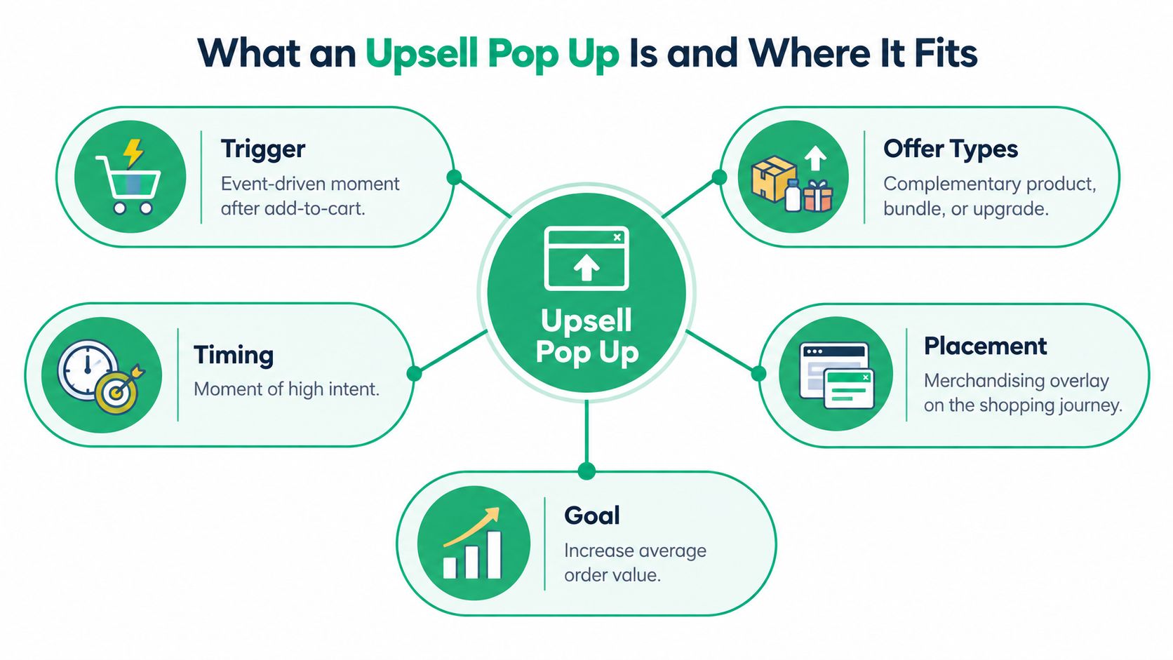
An upsell pop up is an event-driven merchandising overlay. It appears when the shopper has already shown intent, usually after adding an item to cart, and it offers a complementary product, a bundle, or an upgrade that fits the current context.
The useful placements are easy to separate. Add-to-cart popups fire right after a confirmed cart action. Cart-page upsells sit inside the cart experience. Post-purchase offers appear after payment. Checkout extensions are the most constrained and are generally reserved for Shopify Plus flows. Generic discount or email-capture popups are different tools. They try to collect attention. An upsell popup tries to grow the order.
ServeApps' UpServe is a concrete example of that model. It shows add-to-cart upsell popups with frequently bundled offers, discount options, pixel-level design controls, and per-popup analytics, while checkout upsells are available on Shopify Plus. If you want a practical recommendation resource on offer logic, the YipSMS Inc. guide to Shopify recommendations is worth a look because it focuses on contextual product matching rather than random merchandising.
Match the popup type to the job
- Add-to-cart popup: Best for obvious add-ons that belong with the item already chosen.
- Cart-page upsell: Good when the shopper is still editing the basket and can absorb one more decision.
- Post-purchase offer: Strong for higher-intent add-ons after the main sale is safe.
- Checkout extension: Use only when the offer is small, obvious, and operationally clean.
The rule is straightforward. The closer the offer sits to payment, the lower the risk to the original sale. The earlier the offer appears, the more carefully it has to earn its place.
Choosing the Right Trigger Point in the Shopper Journey
A running-shoe buyer makes the trade-off obvious. If they land on the product page and see a popup instantly, they haven't committed yet. That offer feels like a hurdle. If they add the shoes to cart and then get a clear offer for performance socks or cleaner, the popup feels like help.
Timing follows intent, not habit
Product-page entry is the weakest trigger. The shopper is still comparing options, and you don't know enough about intent to push an extra decision. Scroll depth is better, but only slightly. It says the visitor is engaged, not ready to buy.
The strongest trigger is the confirmed add-to-cart response. That event tells you the shopper has crossed from browsing to active consideration. At that point, a compatible accessory, a bundle, or a quantity incentive has a real chance of being useful instead of annoying.
A popup should react to a purchase signal, not interrupt a research session.
What helps and what hurts
Cart-page render can work when the shopper is already in editing mode. It's a good place for a small add-on, especially if the original cart is thin and the extra item clearly improves the basket. Post-purchase is different. The sale is already secured, so the offer no longer has to compete with checkout anxiety.
The mistake is assuming earlier is always better. Earlier means more exposure, not better economics. If the offer appears before the shopper has moved from browse mode to buy mode, you're making them solve two tasks at once, choosing the product and evaluating your popup.
For merchants who want a Shopify-specific trigger reference, the ServeApps upsell popup overview is useful because it frames the popup around cart behavior, not generic promotion. That's the right mental model.
The practical standard is blunt. Fire on a real intent event, anchor the offer to the item just added, and avoid anything that competes with the shopper's main action.
Messaging and Design That Earn the Click
A strong upsell pop up doesn't need cleverness. It needs clarity. The shopper should understand the offer in a few seconds, know why it fits, and see an easy way out if they're not interested.
What to say
Anchor the message to the item already in cart. If the shopper added running shoes, the popup should talk about socks, laces, or cleaner, not a random bestseller. Lead with utility before price. The price can support the offer, but it shouldn't carry the whole argument.
Keep the copy short and concrete. Say what the add-on does, why it matches the cart, and what happens if they accept. If the offer depends on a bundle or compatibility rule, make that obvious. Confusion kills acceptance faster than weak discounting.
What to show
Use one clear product image, not a collage that forces comparison inside the popup. On mobile, the image, price, and action need enough space to be tapped without misfires. If the product isn't recognizable at a glance, the popup is asking for too much attention.
The UI should make the close action impossible to miss. Hiding dismissal controls is cheap in the short term and expensive later, because it teaches shoppers that every popup is hostile. That's a bad habit to build.
What to avoid
- Don't bury dismissal. A visible close control protects trust.
- Don't autoplay video. It turns a quick decision into a performance.
- Don't stack popups. One interruption is enough.
- Don't over-style the offer. If the popup looks like a banner ad, it won't feel native.
ServeApps' UpServe exposes pixel-level controls like colors, corners, shadows, spacing, and templates, which is exactly the kind of control you need to keep the popup aligned with the store instead of bolted on. The point isn't decoration. It's recognition and speed.
If the shopper can't understand the offer fast, it's too complicated to be an upsell.
Discounting, Bundling, and Frequency Caps
Discounting is where upsell pop ups become margin leaks. A discount can make an offer more attractive, but it can also train shoppers to wait for deals or push them toward a lower-margin basket.
Pick the offer shape deliberately
A percentage discount works when the add-on has enough margin to absorb it and still leave room for profit. A fixed discount can be cleaner when the product price is stable and the reduction is easy to understand. A bundled add-on with no discount is often the healthiest option when the item is naturally related to the original cart and doesn't need a price cut to make sense.
The rule is simple. If the offer can't pay for itself after discount cost and downstream fallout, it isn't an upsell. It's a margin donation.
Don't repeat yourself into irrelevance
Frequency caps matter because repetition kills attention. If the same popup appears every session, shoppers stop seeing it as guidance and start seeing it as noise. Dismissal persistence matters for the same reason. If they close it once, respect that signal.
That's also why mutually exclusive offers matter. A shopper who already dismissed one accessory shouldn't see a near-identical one two minutes later. The store loses credibility when it behaves like it didn't hear the answer.
For merchants comparing bundle structures, the ServeApps product bundling pricing examples page is useful because it shows how pricing logic and offer structure need to fit together. The price is not a separate decision from the popup. It is the popup.
Use the right incentive for the cart
If the basket is thin, a threshold incentive can work. If the add-on is obvious and cheap, a simple accessory bundle is usually better. If the product needs explanation, don't force a discount to do the talking. Better relevance beats deeper markdowns.
A smart merchant treats discounting as a controlled tool, not a default setting. The best upsell pop ups often earn their keep with relevance first and price second.
Measuring Incremental Revenue Instead of Popup Credit
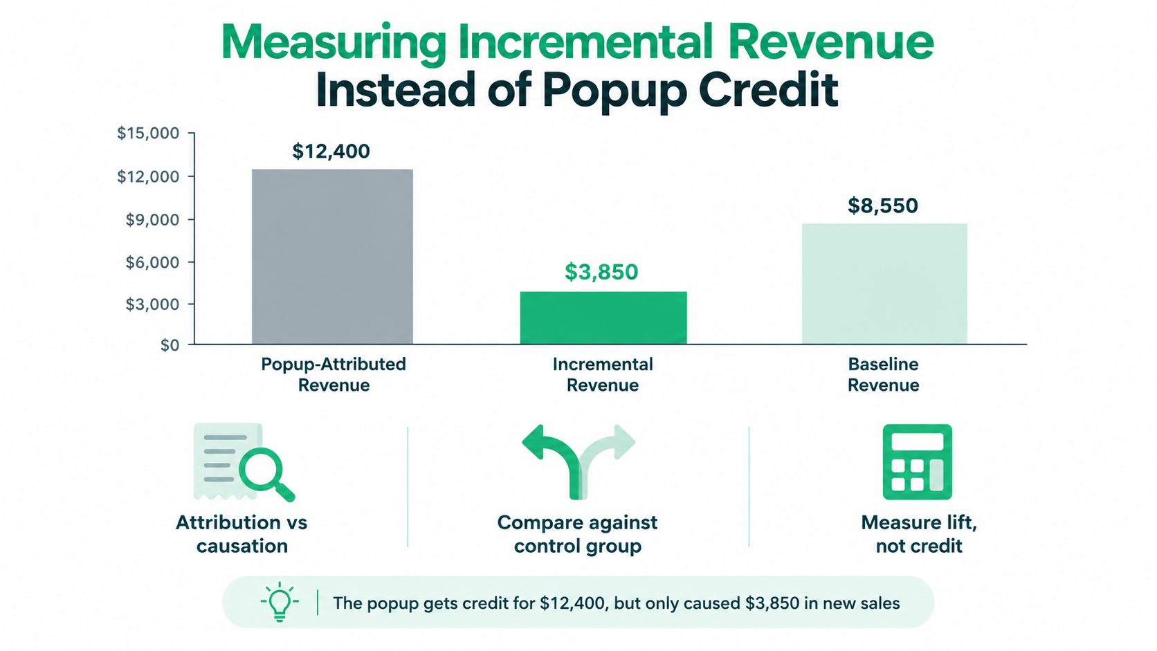
Popup-attributed revenue is a vanity metric unless you can prove lift. A popup can get credit for orders that would have happened anyway, and most dashboards won't tell you the difference.
Track causation, not applause
The right primary metric is incremental revenue per exposed visitor. That's the cleanest way to see whether the popup creates new value. After that, track incremental items per order, incremental gross margin, and anything that shows whether the original order path stayed healthy.
A holdout group is the simplest way to separate real lift from credit-stealing. Show the popup to one cohort and withhold it from another, then compare the outcomes. If the exposed group has higher net value without a dip in checkout completion, you've got something worth scaling.
If you can't explain lift against a control, you don't know whether the popup helped or just interrupted less expensive shoppers.
Use the app data as diagnostics
Impressions, acceptance rate, and popup revenue still matter, but they belong in diagnostics, not on the throne. They help you see whether the offer is being seen and whether the creative is understandable. They don't prove profit.
A raw conversion rate from a vendor widget is especially weak evidence when discount depth, traffic quality, and attribution windows are unclear. That's why a merchant should care more about net margin, refunds, and downstream support than about a shiny popup report.
For a practical funnel-oriented reference, the ServeApps Shopify upsell funnel guide helps connect offer flow to measurement logic. That's the right connection to make, because a popup is only useful if it fits into a tested revenue path.
The clean dashboard answer is this. Show me exposed versus control. Show me margin after discounts and refunds. Show me whether the original cart still converts. Anything else is a story, not evidence.
Mobile, Accessibility, and Performance Guardrails
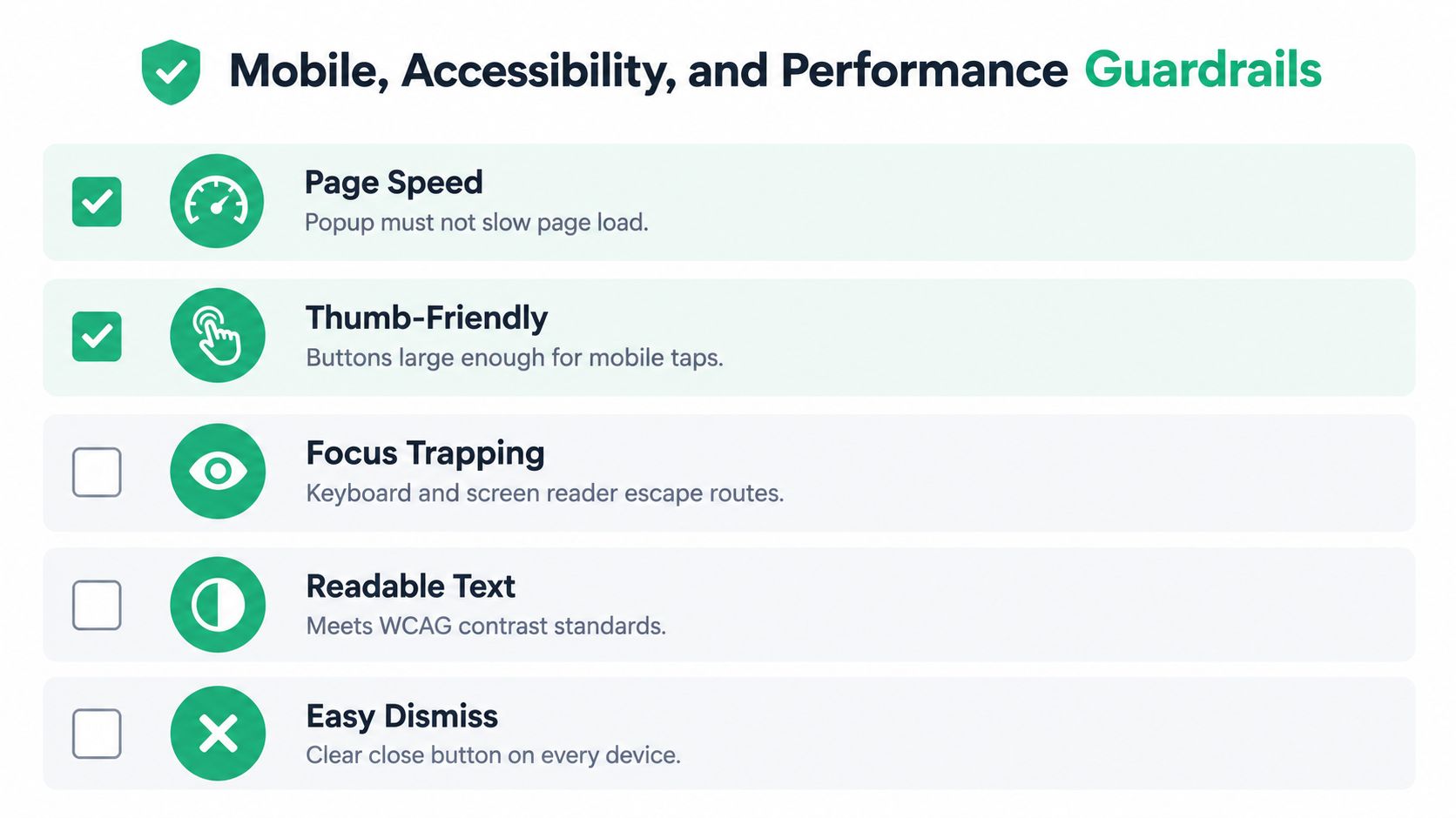
A popup that looks fine on desktop can fall apart on a phone. Thumb taps are less precise, screens are smaller, and any extra load on the page is more noticeable. If the design isn't built for mobile first, it's not built for commerce.
The non-negotiables
- Page speed: The popup must not slow the page down.
- Thumb-friendly controls: Tap targets need to be easy to hit on mobile.
- Focus trapping: Keyboard and screen-reader users need a clean escape path.
- Readable text: Contrast and sizing have to hold up in real use.
- Easy dismissal: Every device needs a clear close control.
Baymard's UX work is based on more than 200,000 hours of testing with over 18,000 users across 90-plus leading U.S. and European sites (Baymard research overview), and Nielsen Norman Group's guidance is clear that overlays shouldn't block relevant content or interrupt essential tasks. That's the baseline. A popup should never make the shopper fight the interface just to continue buying.
Desktop and mobile are not the same problem
Desktop users can tolerate a richer layout, but mobile users need speed and restraint. Preserve the cart state if they close the offer, and don't punish them for saying no. If the popup changes the page structure enough to cause layout shifts or awkward reflow, it's too heavy.
Shopify-native theme app extensions are the safer route because they limit loading to the templates and events where the offer is configured. That keeps unnecessary scripts off pages that don't need them. It also reduces the chance that an upsell popup improves acceptance while harming discovery or checkout completion.
A merchant should ship an upsell popup only after it passes the obvious test. Can a shopper see it, understand it, dismiss it, and keep moving without friction? If the answer is no, the campaign isn't ready.
ServeApps builds Shopify-native tools for cart experiences, contextual upsell popups, and post-purchase operations, so merchants can tie merchandising decisions to measurable order outcomes instead of guessing from dashboard credit. If you want to test an upsell pop up that's built around context, analytics, and control, visit ServeApps and review the options against your own margin targets.
Shopify Store Credits: Issuing, Redeeming and Accounting
Learn what Shopify store credits are, how they differ from gift cards and refunds, and how to issue, redeem and account for them.
Read more →
Can You Have Multiple Stores on Shopify? Plans and Limits
Can you have multiple stores on Shopify? Yes, through organizations or Plus expansion stores. Compare plan limits, eligibility and setup tips.
Read more →
Product Customizer App Shopify: Choosing the Right Tool
Compare native and third-party product customizer app shopify options on speed, theme support, variant mapping and SKUs before you install one.
Read more →