
Customers check delivery status an average of 4.6 times per order, according to Gorgias's guide to customer support metrics. Four or five visits to a page that plenty of stores build once during launch week and never open again.
The appetite for self-service is real, and it's badly served. The same guide, citing Gartner, reports that 73% of customers try self-service at some point, while only 14% of customer-service issues are fully resolved through self-service overall. For very simple issues, the resolution rate reaches 36%.
That gap is the opportunity. Post-purchase questions about status, delivery timing and permitted changes are simple and tied to one transaction, which is exactly the category self-service can finish. The order status page is the one screen that already holds the order, the customer and the permission to act in the same place. Treat it as an exception-handling hub rather than a tracking lookup, and it stops being a receipt and starts doing work.
Table of Contents
- What an Order Status Page Is and Why It Matters
- Core Elements Every Order Status Page Needs
- Writing Status Messages for Delays and Changes
- Making the Page Usable with Keyboard, Screen Readers and Zoom
- Which Self-Service Edits to Allow and How to Limit Them
- How to Set Up Edits and Upsells on Your Order Status Page
- Audit Your Order Status Page This Week
What an Order Status Page Is and Why It Matters
Think of the order status page as the follow-up desk that stays open after the cash register closes. The sale is finished, the receipt is in the inbox, and the customer now has practical questions: where is it, when does it land, can I still change the size. Shopify's guide to managing order details defines the page as the final page in the checkout process. After completing checkout, the customer receives a URL that leads to it, and from there they can track order status and contact the merchant with questions.
That URL is tied to one completed transaction, which is what makes the page useful. It can show exactly what this customer bought, where that parcel currently is, and which changes they're still allowed to make. It isn't a generic tracking form that asks for an order number and a postcode. It already knows both.
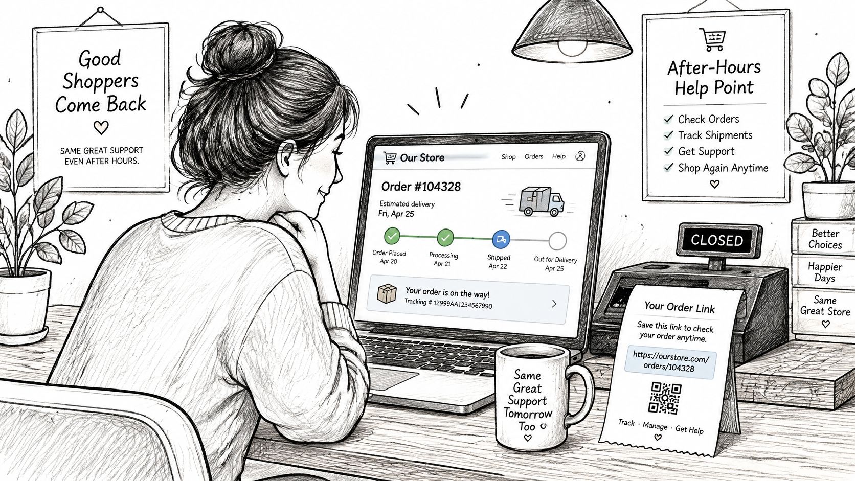
Support teams get the same view. From an order record in Shopify Admin, a merchant can open the identical customer-facing page using "View order status page", so an agent can see what the buyer sees before replying. That one habit ends the round of emails asking the customer to send a screenshot.
A hub, not a tracking lookup
A basic tracking screen answers a single question, where is my parcel, then hands the customer off to a carrier site full of scan codes and abbreviations. The order status page is broader by design. It carries status, expectations and the next steps your store permits, in the environment the customer already trusts after paying.
The difference decides whether the page pays for itself. A customer who finds an answer on the page doesn't open a ticket. A customer who hits a dead end, or a tracking link that dumps them on a carrier site with no context, does.
Working rule: if the answer to your most common post-purchase question isn't on the page, the page is generating tickets rather than preventing them.
Start with the questions, not the layout
Pull your last 50 post-purchase emails and count the recurring themes. Most stores land on four or five: where is my order, when will it arrive, can I change the address, can I swap the size, can I cancel. Write that list down, then mark which ones the page could answer without a person. Those marked questions are your build order, and anything you can't answer clearly belongs behind a clear route to support rather than a vague promise.
Core Elements Every Order Status Page Needs
A useful order status page puts shipping details first, then shows what the customer can still do. Customers often look for the delivery estimate, carrier, tracking number and shipment progress. Keep those details together so they can understand the order before choosing an action.
| Element | Question it answers | Example display |
|---|---|---|
| Order status | Where is my order right now? | Packed, awaiting carrier pickup |
| Delivery estimate | When will it arrive? | Expected delivery date |
| Carrier and tracking number | Who has it, and how do I follow it? | Carrier name with linked tracking number |
| Shipment progress | Has it moved since I last checked? | Moved to sorting hub, with timestamp |
| Shipping address | Is it going to the right place? | Address with edit link before fulfillment |
| Items and quantities | Is my order correct? | Line items with variant and quantity |
| Available actions | Can I still change or cancel it? | Edit items until the stated cutoff |
| Support contact | Who do I ask if something is wrong? | Contact form with order number pre-filled |
The two rows most stores leave blank
The delivery estimate. Customers need a date they can use to plan. If your store can calculate one from the order date, handling time and carrier transit estimate, label it “expected” to show that it is a forecast, not a guarantee. If you cannot provide a reliable date, say so plainly rather than display a guess.
The cutoff on actions. State when changes close and what determines the cutoff, such as fulfillment starting or a set time after purchase. A clear rule helps customers decide whether to edit the order or contact support.
Status above, actions below
Put fulfillment details in the upper part of the page and transactional controls below them. That order lets customers check the situation before deciding whether to act.
Shopify's order status extension targets reference describes where app blocks can appear, including locations after line items, the line-item list and customer information. Available targets and data can vary with the order's processing state, so design for missing fields. If a tracking number has not been issued, show a clear message instead of an empty row.
The confirmation screen and status page serve different points in the customer journey. See what belongs on an order confirmation screen for the earlier step. Check each row in the table against a real order, and make sure customers have a clear route to support when an answer or action is unavailable.
Writing Status Messages for Delays and Changes
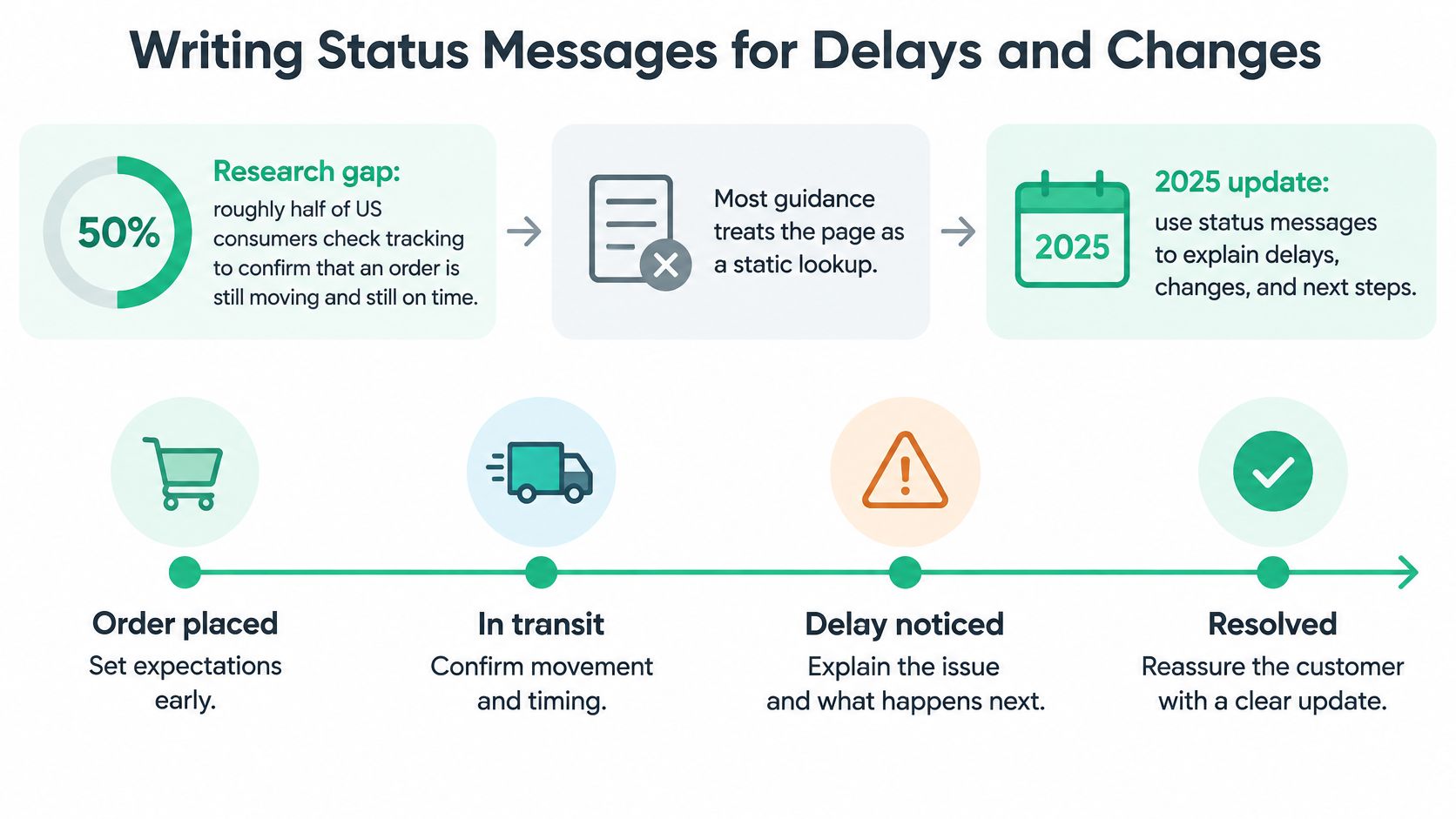
A tracking page can show a scan without answering the customer's main question: should I wait, or do I need to act? Treat the order status page as an exception-handling hub. For every delay or change, explain what happened, what it means for the delivery, and what the customer can do next.
Build a hierarchy that survives a bad week
When a delivery goes off schedule, put the information in this order: the original promised date and the revised estimate, the latest carrier event and its timestamp, a plain-language explanation, then a next step with a response window. This gives customers a clear path through the problem instead of a pile of tracking data.
| Status | What the customer sees | Next action offered |
|---|---|---|
| Received | Order confirmed, with the next expected update | Edit items if the editing window is open |
| Preparing | Order being packed, with the expected ship date | Change the address before fulfillment locks |
| Shipped | Carrier name, tracking link and latest scan | Track the parcel or contact support |
| Delayed | Revised delivery estimate and the reason, if known | Wait for the new estimate or contact support |
| Missing scan | Latest confirmed event and when to check again | Check after the stated time, then contact support |
| Delivered | Delivery date and any available location details | Report a delivery problem through the stated support route |
Translate the scan code, don't publish it
Carrier messages often describe internal events rather than customer-friendly milestones. Translate them into a short sentence with a date: “Your parcel left our warehouse on Monday. The current delivery estimate is Thursday.” If the carrier has not provided a new estimate, say that plainly and give the customer a time to check for another update.
Make responsibility clear, too. You handle order changes and your own cancellation rules; the carrier handles scans, reroutes and delivery attempts. When the next step depends on the carrier, say so and explain how the customer can follow up. Clear ownership and timing can prevent a status message from turning into a support ticket.
For an example of how a post-purchase update can be structured, see this walkthrough.
Keep reusable messages in a document the team can update. Write one for each status in the table, then revise the relevant sentence when handling times or carrier wording changes. The page should tell customers what changed and what to do, without making them decode a scan or ask support for the next step.
Making the Page Usable with Keyboard, Screen Readers and Zoom
The order status page is the least static page in a store. It carries live tracking updates, edit controls, cancellation buttons and a shipment timeline, and each of those is a place where a customer can get stuck. Most ecommerce design writing covers branding and conversion and skips whether a keyboard user can reach the cancel button at all.
WCAG 2.2 sets the baseline: text alternatives for non-text content, consistent navigation, and operation without multipoint or path-based gestures. On a status page, that translates into five concrete requirements.
- Every visual progress bar needs a text twin. A five-step graphic means nothing to a screen reader, so print "Step 2 of 5, packed" beside it.
- Live changes need announcing. When tracking updates without a page reload, the change has to be spoken, or a screen-reader user never learns the parcel moved.
- Focus must survive the update. If an asynchronous refresh sends focus back to the top of the page, the customer loses their place mid-edit.
- Controls need names and room. Quantity steppers, address fields and cancel buttons need labels that say what they do and touch targets large enough to hit on a phone.
- Dialogs must work without a mouse. A cancellation confirmation that only closes on a click traps keyboard users inside it.
A seven-check test you can run this afternoon
- Use only the keyboard. Tab through every control and confirm you can see where you are at each stop. If you can't, that customer calls or abandons the change.
- Listen to a status change with a screen reader. Trigger an update and confirm it's announced. Silence here gets reported as "the page is broken".
- Zoom to 200% and narrow the window. Nothing should overlap or disappear. Low-vision customers who lose the tracking number email to ask for it.
- Remove colour from the status cues. Delayed, in transit and delivered need words or icons, not just amber and green.
- Edit something and watch the focus. After the update lands, focus should stay where the customer was working.
- Submit a bad value on purpose. The error should say what went wrong and how to fix it, next to the field.
- Check the login step, if there is one. Authentication that depends on a drag gesture or a timed puzzle blocks people before they reach the order.
A customer who can't work the cancel button with a keyboard isn't self-serving. They're emailing you.
Accessibility isn't a separate audit phase you schedule after launch. Inaccessible status and self-service controls recreate the exact support demand the page was built to remove, and the fix is usually a label, a sentence or a focus rule rather than a rebuild.
Which Self-Service Edits to Allow and How to Limit Them
Self-service editing doesn't need a second portal with its own login and its own password reset flow. It runs inside the page the customer already has open, embedded in your theme, exposing only the actions your settings allow. That constraint is the feature: the page can offer a swap without ever offering a refund.
| Permission | Common setting | Problem it prevents |
|---|---|---|
| Variant swap | Allow, with choices limited to live stock | Customers picking unavailable sizes or colours |
| Quantity reduction | Allow only before fulfillment starts | Refund disputes after packing |
| Item removal | Allow, with price difference settled automatically | Manual refunds and mismatched totals |
| Address change | Allow until fulfillment locks | Parcels sent to the wrong address |
| Full cancellation | Block for final-sale, made-to-order or pre-order orders | Cancelling goods already made or reserved |
| Gray-area cancellation | Route to an approval queue with a stated reason | Unreviewed refunds and inconsistent decisions |
The cancellation that shouldn't reach your inbox
Say a customer orders a made-to-order item on Monday and asks to cancel on Wednesday, after production has started. A page with no rules either hides the cancel button or accepts the request and leaves you to reverse a refund by hand. A page with rules blocks the full cancellation for tagged orders, tells the customer why in plain words, and routes the request to an approval queue where the team approves or denies with one click and the customer gets a status update with the reason. The request stays visible, the decision stays consistent, and the inbox stays out of it.
Decide the rules before launch
Improvised rules produce inconsistent answers, and inconsistent answers produce tickets about tickets. Settle each row of that table in one session with whoever owns fulfilment, then keep the document where the support team can read it. Gray-area cancellations always carry a stated reason, because the reason is what makes two agents decide the same case the same way.
Address changes are the most time-sensitive permission of the lot, and the guide to letting customers edit a shipping address covers the mechanics and the cut-off that keeps a parcel from leaving for an old address.
The rules work when they're set early. F3 Gear Store processed 102 self-service order edits with 0 support emails required, which is what a settled rule set looks like in practice. Before you switch anything on, write down the one edit you'd never allow and the one you'd always allow. Those two answers set the tone for everything in between.
How to Set Up Edits and Upsells on Your Order Status Page
Configuration is mostly a sequence of small decisions, and each one has a check that proves it worked. Eight steps, in the order that avoids rework.
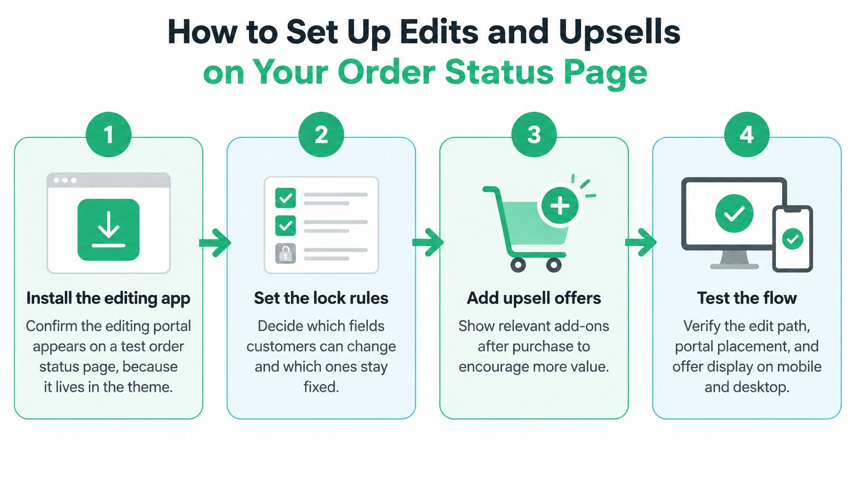
- Install the editing app and confirm the portal renders. Because the portal is part of your theme, check it on a real order status page rather than in a preview. If it doesn't appear, the theme block is missing or the app embed is off.
- Set the lock point. Edits lock by default when fulfillment starts, and you can also set a fixed window such as one hour after purchase, with whichever comes first taking effect. Pick the one that matches how fast you pack, then write the cutoff into the page copy.
- Choose the permissions. Variant swaps, quantity changes, address updates and cancellation rules come straight from the decisions above. Turning everything on isn't a strategy, because every permission you grant is a commitment you have to honour at 6pm on a Friday.
- Use order tags for exceptions. One tag, such as selfserve_canedit, opens editing on a single order and removing it closes editing again, so a VIP or a problem order never needs custom code.
- Turn on notifications for every change type. Additions, removals, quantity changes, shipping method changes, address updates and cancellations should each reach the team as they happen, not in tomorrow's report.
- Place upsell blocks below the editing controls. Two or three relevant products, matching accessories or a complementary item, not the catalogue. A relevant recommendation made during order editing converts at 3 to 5 times the rate of a static thank-you page upsell.
- Place a test order and check the admin. After a customer edit the order updates in Shopify Admin instantly, inventory adjusts, shipping recalculates and tags are applied. Open the order and confirm all four before you trust the portal.
- Test the revert. Start an edit, leave payment unfinished and walk away. If payment isn't completed within 15 minutes, the order reverts to its original state, which is the safety net that makes self-service safe to offer at all.
What a correct test looks like
The admin order matches what the customer saw on the page, the totals reconcile, and no step needed a manual correction. If you had to fix something by hand, the permission or the lock point is wrong. The customer did nothing unusual.
Check before launch: place the test order on a phone, not a desktop. That's where the first real edit will arrive.
Judge the upsell by what it removes
Two rules keep offers from undoing the work. An offer never sits above the edit controls, and it never delays the confirmation the customer came for. Beyond that, measure each block by its acceptance rate and by the support contacts it removes, because a bundle that triggers three address questions a week costs more than it earns. For the broader picture of placement and sequencing, the guide to post-purchase upsells is worth reading before you add a second block.
Audit Your Order Status Page This Week
A good order status page answers status and delivery questions first, explains exceptions in plain words, works for every customer, and offers only the edits the store can honour. That's the whole standard, and most stores fail at least two parts of it.
Set aside an hour and work from the top.
- Elements. Compare the live page with the required-elements table and note every blank row.
- Messages. Confirm each of the six order states has a plain message and one next action, including the missing-scan case nobody writes.
- Access. Run the keyboard pass first, because it takes four minutes and catches the worst failures.
- Permissions. Hold your live edit rules against the permission table and flag anything you'd have to explain to a customer.
Finish in one sitting by placing a real test order from checkout to delivery notice in Shopify Admin. Check that the order record matches what the customer saw, that an edit updated inventory and shipping, and that the revert window closed cleanly. If the gap sits in self-service editing, an app such as SelfServe from ServeApps embeds the editing portal on the order status page, and you can test it on a single order before rolling it out.
Then put a date in the calendar ninety days out. Carrier service names change, handling times move and inventory shifts, so this audit is quarterly maintenance rather than a one-time project.
ServeApps builds SelfServe, which puts a self-service editing portal directly on your order status page so customers can swap a variant, adjust a quantity, update an address or cancel within the rules you set, with price differences settled automatically. You can install it, place one test order and watch the whole loop, from the edit to the order updating in Shopify Admin, before you commit to a wider rollout. Visit ServeApps to see the apps and start with a single order.
What Is Upsell? Examples and How Shopify Stores Use It
What is upsell? Learn the definition, how it differs from cross-selling, and how Shopify stores use upsells to raise order value.
Read more →
Increase Conversion Rate on Website: 9 Proven Cart Tactics
Increase conversion rate on website with cart, upsell, and testing tactics. See what lifts AOV, cuts abandonment, and how to apply each one today.
Read more →
8 Self Service Store Examples: Benefits and Tactics
Explore 8 self service store examples, from cashierless checkout to post-purchase portals, with benefits, trade-offs, and tactics you can copy.
Read more →