
You're paying to bring shoppers to your store. They browse, choose a size, and add a product to their cart. Then they disappear, leaving you wondering whether to change the offer, redesign the site, or buy better traffic.
A shopper who likes the product and still leaves isn't necessarily rejecting your brand. They may have hit a cart that buries the next step, a shipping charge they didn't expect, or a checkout that asks for more information than they want to provide.
The opportunity is substantial. Baymard Institute's compilation of ecommerce studies reports an average cart abandonment rate of 70.22% across multiple markets and study periods. That's a benchmark, not a diagnosis of your store, but it's a reason to inspect what happens after add-to-cart.
Start with the purchase journey, not a redesign. Watch where shoppers stop, identify the decision they couldn't complete, and change the smallest relevant part of that experience.
- Before payment: Make the cart clear, relevant, and easy to act on.
- During checkout: Remove uncertainty about costs, delivery, and payment.
- After payment: Offer useful additions and let customers fix mistakes without cancelling.
The same focus on a clear next action applies in conversion guidance for early-stage SaaS founders, but ecommerce needs an additional safeguard: more purchases shouldn't come at the expense of margin or retained orders.
Table of Contents
- 1. Add-to-Cart Product Bundling and Cross-Sell Upsells
- 2. Cart Drawer with Spend-Tier and Free-Shipping Progress Goals
- 3. Post-Purchase Upsell Offers
- 4. Self-Service Order Editing to Protect Orders
- 5. Localized Cart and Currency Previews for International Shoppers
- 6. Simplified, Brand-Aligned Cart Experience
- 7. Per-Offer Analytics and Iterative Testing of Upsells
- 8. Trust Signals and Fast Support at Decision Points
- 9. Mobile-First Cart and Upsell Design
- Where each conversion tactic acts and what it costs to get right
- Pick One Test, Measure It, Then Expand
1. Add-to-Cart Product Bundling and Cross-Sell Upsells
Offer a useful companion product when the shopper adds the main item, not a random bestseller. A garment bag alongside occasionwear makes sense. An unrelated clearance product creates another decision without helping the original purchase.
Keep the shopper's selected product and cart state intact.

Say you sell linen shirts. Offer the matching shorts with the correct available variants, explain any bundle discount beside the price, and let shoppers decline without hunting for a close button. Don't make accepting the offer a condition of continuing.
Start with a pairing supported by order history. Frequently co-purchased products are a useful starting point, but check whether customers need both together. Repeat purchases of consumables may reflect replenishment rather than a sensible bundle.
Test incremental value, not popup clicks
Track completed-order revenue per exposed session, with purchase conversion as a guardrail. An offer that attracts clicks but delays checkout isn't necessarily helping.
- Keep the offer focused: Present a primary recommendation rather than a miniature catalog.
- Show the full deal: Display the add-on price, discount conditions, and selected variant before acceptance.
- Control repetition: Avoid showing the same declined offer throughout the visit.
The embedded video provides a visual reference for the add-to-cart experience.
If the popup reduces completed purchases, test an inline recommendation inside the cart instead.
2. Cart Drawer with Spend-Tier and Free-Shipping Progress Goals
A beauty customer has cleanser in their cart and is considering a refill. A clear shipping threshold can help them decide whether adding the refill makes financial sense. A vague rewards banner can't.
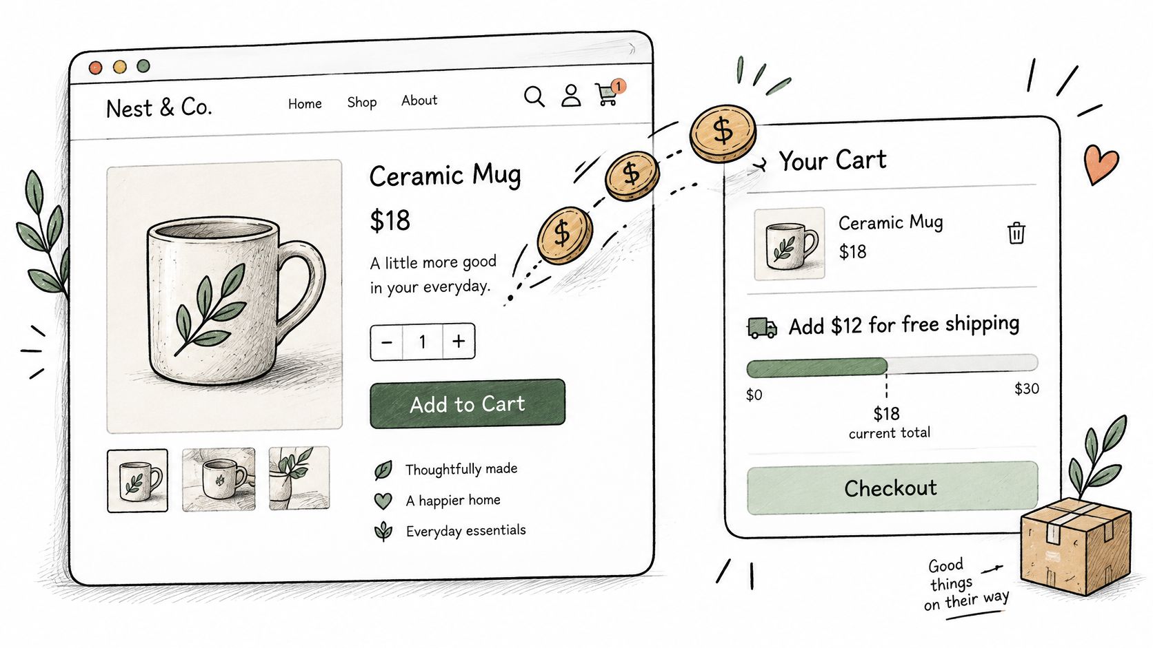
A cart drawer keeps that decision beside the products, subtotal, and checkout button. Show the next available reward and the amount remaining, then update both when shoppers change quantities or remove items.
Make the relationship between basket value and reward easy to understand.
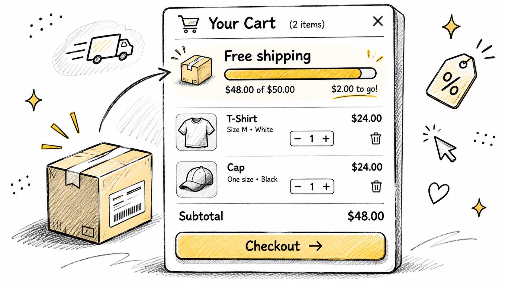
Set the threshold using shipping cost and contribution margin, not a competitor's banner. A higher basket total doesn't help if you subsidize expensive shipping and discount products customers would have bought anyway.
Make the reward dependable
Use this Shopify free-shipping bar guide to plan the presentation, then verify the actual shipping rules behind it. Check whether discounts, subscriptions, excluded products, and destination changes affect eligibility.
Practical rule: Never promise a cart reward that checkout can take away without a clear explanation.
Test a shipping goal separately from gifts or spend-tier discounts. Otherwise, you won't know which incentive changed behavior.
Measure contribution margin per cart session, supported by average order value and cart-to-purchase conversion. Also inspect baskets that stop just below the threshold. If reaching the reward requires an irrelevant purchase, improve the product suggestions or reconsider the threshold rather than making the progress bar more aggressive.
3. Post-Purchase Upsell Offers
Confirm the purchase before asking for another one. Customers arriving on the order confirmation page need to know their payment succeeded and what happens next. An offer shouldn't obscure those answers.
For a coffee equipment store, a compatible filter pack can be a sensible post-purchase recommendation. Another brewer is a harder sell because it asks the customer to reconsider a major decision they've just completed.
Keep the original order details recognizable beside the offer.
Explain whether the addition ships with the existing order and whether it changes shipping charges or delivery timing. Use saved-payment acceptance only where your implementation supports it, and clearly disclose any additional charge before the customer accepts.
Separate acquisition from expansion
A post-purchase upsell aims to increase revenue after the original conversion. It doesn't demonstrate that more visitors completed their initial purchase.
Track net incremental revenue per eligible order, not just accepted offers. Deduct discounts, refunds, and additional fulfillment costs when evaluating the result.
- Exclude duplicates: Don't recommend something already purchased unless an extra unit is useful.
- Respect fulfillment: Suppress offers that can't be added reliably to the shipment.
- Keep deadlines honest: Use an acceptance window only when there's a real operational reason.
Compare eligible orders with and without the offer. If customers add products and later remove them, the acceptance rate overstates the benefit.
4. Self-Service Order Editing to Protect Orders
A customer notices they ordered the wrong size immediately after payment. If the only available action is emailing support, they may ask to cancel while waiting for an answer. Letting them correct the variant gives them a direct way to keep the purchase.
Order editing protects completed orders rather than increasing initial checkout conversion. Measure it separately so you don't confuse retained revenue with new purchases.
Useful edits include size or color swaps, address corrections, quantity changes, and shipping-method updates. These self-service store examples can help you decide which actions belong on your order status page.
Build rules around fulfillment
For an apparel store, allow available size swaps before the warehouse starts picking. For personalized products, close editing before production begins, even if ordinary products remain editable.
- Define eligibility: Use fulfillment status, product type, and order tags to control access.
- Reconcile payment: Collect price differences or issue applicable partial refunds before treating the edit as complete.
- Handle failure: Confirm what happens when additional payment fails or an editing session is abandoned.
Saving an order means fulfilling the corrected purchase successfully, not merely recording an edit.
Track cancellation rate among edit-eligible orders, alongside retained revenue, order-change tickets, and fulfillment errors. Compare equivalent groups and inspect cancellation reasons rather than assuming every edited order would otherwise have been cancelled.
Test inventory updates and warehouse notifications before launch. An easy customer interface won't help if the fulfillment team ships the original variant.
5. Localized Cart and Currency Previews for International Shoppers
Open your store as a shopper in each active market. Add a product, apply a discount, check the shipping reward, and continue to payment. Look for any point where the currency, tax treatment, or delivery promise changes unexpectedly.
Localization needs to extend beyond the product price. A cart displayed in local currency can still be confusing if its free-shipping goal uses the home-market threshold or its duties message contradicts checkout.
Say a clothing store serves domestic and overseas customers. The overseas customer should see the relevant shipping conditions, supported payment currency, and a clear explanation of applicable duties, not a domestic promotion that disappears later.
Preview the entire transaction
Give your team a repeatable market review:
- Currency consistency: Check product prices, discounts, cart totals, and checkout currency.
- Shipping eligibility: Verify that reward thresholds match the destination and shipping rules.
- Tax clarity: Distinguish included charges from estimates and amounts payable later.
- Market selection: Let shoppers correct their location instead of relying entirely on automatic detection.
Don't present estimates as final landed costs. If duties aren't collected at checkout, say so before payment and explain what the customer may need to pay on delivery.
Test cart-to-purchase conversion by market, with shipping-related abandonment and support contacts as supporting measures. Compare results within each market rather than treating differences between countries as proof of a cart problem.
Start with a market that has meaningful traffic and obvious pricing inconsistencies. Fixing an incorrect promise is more useful than translating decorative cart copy.
6. Simplified, Brand-Aligned Cart Experience
A cart earns its keep by answering four questions fast: what did I choose, what does it cost, can I change it, and where do I pay? Anything that slows those answers belongs after checkout or nowhere.
Simplification is a discipline. If a field, link, badge, or message does not help verification, correction, cost clarity, or payment, treat it as optional until it earns a click. Keep the decision details and cut the detours.
For a homewares store, keep the product image, selected finish, quantity, price, delivery information, and checkout action visible. Move editorial content and unrelated collection links elsewhere.
Remove distractions, not decision-critical details
Make checkout the primary visual action, while keeping removal and quantity controls easy to find. Match typography, spacing, and button treatment to the product page so the cart reads as the same store, not an unfamiliar overlay.
A no-code builder can make changes easier, but it doesn't replace quality assurance. On Shopify, verify compatibility with your Online Store 2.0 theme, subscriptions, bundle logic, and any customized cart behavior.
Design safeguard: A cleaner cart must still explain what the customer is buying and paying.
Test one specific change, such as removing secondary navigation or collapsing an optional note field. Don't combine a new layout, incentive, and recommendation engine in the same experiment.
Measure cart-to-checkout initiation, then confirm completed purchases and revenue per session hold up. If the cart gets cleaner but support questions or cancellations rise, the simplification removed information customers still needed.
7. Per-Offer Analytics and Iterative Testing of Upsells
An accessory offer can generate plenty of additions while contributing little profit. Customers may remove it later, abandon the larger basket, or accept a discount on something they intended to buy anyway.
Follow each offer through to the completed order. Record its identifier, placement, eligible audience, impressions, acceptances, and resulting revenue. Separate an item added to the cart from an item purchased.
Say a skincare store compares a travel-size moisturizer with a full-size companion product. The travel size may attract more acceptances, while the full-size product produces better contribution per exposure.
Define the winner before launch
Use net revenue per eligible session or offer impression as the primary metric, depending on the experiment. Keep the denominator consistent, and inspect purchase conversion and margin as guardrails.
- Change a specific variable: Test the product, discount, presentation, or timing separately.
- Keep eligibility comparable: Don't compare returning customers with first-time visitors and attribute the difference to design.
- Include non-buyers: Evaluating only orders hides shoppers who abandoned after seeing the offer.
- Review operational effects: Watch refunds, stockouts, and fulfillment complexity.
Run the test across a representative sales cycle rather than stopping when an early result looks favorable. If traffic is limited, test a larger, clearer change and accept that small differences may remain inconclusive.
Archive weak offers instead of letting them accumulate. A growing library of popups isn't an optimization program unless someone owns the review and retirement decisions.
8. Trust Signals and Fast Support at Decision Points
Read the questions customers ask before buying. If they repeatedly ask whether sale items are returnable or when an order will arrive, answer those questions near the purchase decision.
A footwear store can place a concise size-exchange summary beside the checkout button, with access to the full policy. That's more useful than a row of unfamiliar security badges that doesn't address the customer's actual concern.
Reassurance works best when it's specific and accurate. Show accepted payment methods only when they're available, and describe delivery expectations using the destination and service where possible.
Put answers where hesitation happens
Checkout usability deserves attention before decorative trust elements. Baymard's checkout usability assessment rates 65% of sites as mediocre or worse, supporting a practical focus on functional clarity.
- Summarize returns: State the important eligibility conditions and direct customers to the full terms.
- Set support expectations: Display staffed hours and a response expectation your team can meet.
- Offer an escape route: Let shoppers contact support without losing their cart.
- Fix recurring confusion: Turn repeated support questions into clearer cart copy.
Don't imply that chat is live when nobody's available. An honest message about when customers will receive help is better than an unanswered conversation.
Measure checkout completion among eligible sessions, with policy-related contacts and support response time as supporting indicators. Avoid treating purchases after a chat as proof that chat caused them, because customers who contact support may already have stronger purchase intent.
9. Mobile-First Cart and Upsell Design
Test the cart while holding a phone, not just while resizing a desktop browser. Open the drawer, change a variant, enter a discount, dismiss an offer, and return from checkout. Any action that requires careful zooming or repeated taps needs attention.
For context, Shopify's reported industry benchmark puts average mobile ecommerce conversion for online retail at 2.89% as of June 2024. That isn't a target for every store, but it reinforces the need to evaluate mobile performance separately.
A fashion store might use a bottom-sheet cart with a visible checkout button and a compact accessory recommendation. The recommendation shouldn't push the subtotal or primary action out of reach.
Keep the primary task usable
Prioritize readable prices, reachable controls, and stable layout. Check that a sticky button doesn't cover product details and that the on-screen keyboard doesn't hide form errors.
- Test real devices: Include different screen sizes and mobile browsers.
- Preserve accessibility: Check focus behavior, control labels, and drawer dismissal.
- Limit interruptions: Avoid stacking a newsletter popup, upsell, and chat prompt.
- Inspect loading behavior: Use browser performance tools and PageSpeed Insights to investigate added scripts and layout movement.
Measure mobile cart-to-purchase conversion, then segment by browser and device category to locate failures. Use error events and failed interactions to diagnose the result, not just aggregate conversion.
If an upsell helps desktop revenue but hurts mobile purchases, change its mobile presentation or suppress it there. You don't need identical interfaces to provide a consistent buying experience.
Where each conversion tactic acts and what it costs to get right
| Item | Funnel Stage | Key Feature | Main Trade-off |
|---|---|---|---|
| Add-to-Cart Product Bundling and Cross-Sell Upsells | Add to cart | Relevant bundle offers shown when shoppers add an item | Poorly matched or frequent popups can feel intrusive |
| Cart Drawer with Spend-Tier and Free-Shipping Progress Goals | Cart | Slide-out drawer shows progress toward rewards or free shipping | Unreachable goals or cluttered drawers can deter shoppers |
| Post-Purchase Upsell Offers | Post-purchase | Relevant add-on offers on the order confirmation page | Lower acceptance rates and added fulfillment complexity |
| Self-Service Order Editing to Protect Orders | Post-purchase | Customers can edit order details within configured rules | Poorly configured rules can create fulfillment conflicts |
| Localized Cart and Currency Previews for International Shoppers | Cart | Displays cart totals and thresholds in local currency | Market-specific setup and testing add complexity |
| Simplified, Brand-Aligned Cart Experience | Cart | Clean, branded cart with a clear checkout action | Excessive customization can create clutter |
| Per-Offer Analytics and Iterative Testing of Upsells | Evaluation and optimization | Tracks offer impressions, conversions, and revenue | Low traffic can make test results unreliable |
| Trust Signals and Fast Support at Decision Points | Cart and checkout | Shows policies, payment reassurance, and support options | Too many signals can clutter the cart |
| Mobile-First Cart and Upsell Design | Cart and checkout | Mobile-optimized layouts, tap targets, and lightweight offers | Limited screen space makes complex offers harder to present |
Pick One Test, Measure It, Then Expand
The best starting point is the problem you can describe with evidence. If shoppers encounter an unexpected shipping charge, clarify shipping before adding a reward mechanic. If customers cancel because they ordered the wrong variant, prioritize a safe correction workflow over another promotional popup.
Match the tactic to the failure. A cart goal can encourage a useful addition, but it won't fix an unavailable payment method. A trust badge won't resolve contradictory return terms, and a post-purchase offer won't repair a broken checkout.
Before changing anything, write a short test brief that your merchandising, support, and development teams can understand.
- Observed problem: Name where shoppers stop or what customers ask to change.
- Proposed change: Describe the specific interface or workflow adjustment.
- Primary metric: Choose the outcome that would justify keeping it.
- Guardrails: Identify margin, cancellation, support, or fulfillment measures that must remain acceptable.
- Decision owner: Assign someone to review results and approve the next action.
Keep your measures distinct. Purchase conversion tells you whether more visitors buy. Average order value describes completed basket value, while retained revenue helps evaluate whether customers keep their orders after payment. Improving one doesn't automatically improve the others.
Choose a test you can interpret
Use a concurrent comparison when your tools and traffic allow it. If you must compare before and after, record promotions, stock availability, acquisition changes, and shipping disruptions that could explain the difference.
Run the test long enough to cover a representative sales cycle. Don't declare success because an early dashboard turns positive, and don't keep a harmful experiment running merely to complete an arbitrary calendar period.
Check implementation alongside commercial results. Confirm that discounts apply correctly, edited orders reach fulfillment, and analytics count purchases rather than just button presses. An apparent lift caused by duplicate events isn't a reason to expand.
Once a change proves useful, keep it stable while introducing the next. That makes it easier to understand which combinations help and which create unnecessary friction.
If you're searching for ways to increase conversion rate on website pages, resist treating every page as a separate redesign project. Follow the customer's task from selecting a product to receiving the correct order. Make the next action obvious, remove the uncertainty around it, and measure whether more customers complete and keep their purchases.
ServeApps offers Shopify-native applications for configurable cart drawers, contextual upsell popups, and self-service order changes. Visit ServeApps to explore the tools or book a demo, then choose the workflow that addresses your store's clearest conversion or cancellation problem.
What Is Upsell? Examples and How Shopify Stores Use It
What is upsell? Learn the definition, how it differs from cross-selling, and how Shopify stores use upsells to raise order value.
Read more →
8 Self Service Store Examples: Benefits and Tactics
Explore 8 self service store examples, from cashierless checkout to post-purchase portals, with benefits, trade-offs, and tactics you can copy.
Read more →
Checkout Process Optimization: A Step-by-Step Audit
Find checkout friction, cut form fields, fix payment failures and test each change. A practical checkout process optimization guide.
Read more →