
You can have a nice-looking free shipping bar and still lose money with it. I've seen that happen when a merchant drops the bar into the cart drawer, sets a random threshold, and never checks whether shoppers can reach it without crushing margin. A free shipping bar Shopify setup works only when it's wired to real cart behavior, real shipping rules, and real market data, not just a theme editor screenshot.
The reason this feature matters is simple, shipping cost is one of the easiest reasons for shoppers to quit late in the journey. Baymard Institute's meta-analysis of 50 cart-abandonment studies reports an average abandonment rate of 70.22% and identifies unexpected or excessive additional costs, especially shipping, as a leading preventable cause of abandonment, while DHL's 2025 global shopper survey found that poor delivery and returns experiences can push four in five customers to abandon their carts (Baymard cart abandonment research, DHL eCommerce Trends 2026). A progress bar turns that uncertainty into a visible rule.
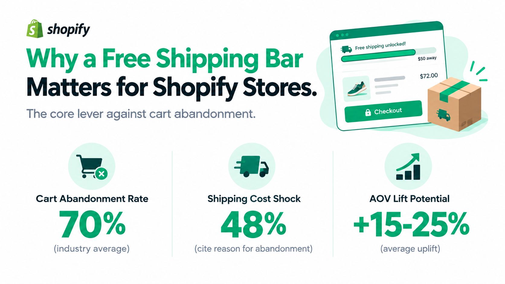
Table of Contents
- Why a Free Shipping Bar Matters for Shopify Stores
- Prerequisites Before You Turn the Bar On
- Choosing a Threshold That Lifts AOV Without Killing Margin
- Configuring the Bar in Your Shopify Cart Drawer
- Where to Place the Bar and How It Behaves on Each Surface
- Troubleshooting the Five Problems That Silently Break the Bar
- Measuring Results and a 30-Day Improvement Checklist
Why a Free Shipping Bar Matters for Shopify Stores
A shopper lands in the cart with two items and pauses at the total. If shipping is still a mystery, that pause often becomes a bounce. A free shipping bar makes the rule visible before checkout, so the shopper can decide whether to add one more item, wait, or leave, and that's a merchandising decision, not a cosmetic one.
The bar changes the question in the shopper's head
Without the bar, the shopper asks, “What's shipping going to cost me?” With it, the shopper asks, “How close am I to qualifying?” That shift matters because the second question has an action attached to it. The offer becomes something the customer can complete instead of something they only discover after cart formation.
DHL's 2026 reporting strengthens the case for international stores. In that survey, 67% of online shoppers said they had abandoned a purchase because delivery didn't meet expectations, 41% said free delivery would have encouraged them to complete a purchase, and 57% said free delivery would encourage them to buy from international retailers (DHL eCommerce Trends 2026). That's why a bar works best when it shows the qualifying amount, currency, and progress clearly, especially across markets.
Practical rule: if the bar doesn't help the shopper make a faster decision in the cart, it's decoration.
The strongest free-shipping bars don't feel promotional. They feel like a store rule that was finally explained at the right time. That's the difference between a conversion instrument and a banner someone scrolls past.
Prerequisites Before You Turn the Bar On
Before touching the design, make sure the data beneath it is honest. A bar built on sloppy shipping zones or missing exclusions will promise things the store can't deliver, and shoppers notice the mismatch fast. I always treat the setup as a shipping audit first and a UX project second.
Clean inputs first, then expose them in the cart
Start with shipping zones that reflect how you fulfill orders by region. If rates vary by country or delivery method, the bar needs to respect that reality instead of flattening it into one promise. If you sell in multiple markets, enable the right storefront markets and make sure the bar reflects the shopper's local currency rather than the admin currency.
Exclusions matter just as much. Oversized items, subscriptions, bundled products, and other lines with separate shipping logic shouldn't distort the qualifying subtotal. If they're included by mistake, the progress message will feel deceptive even when the app is technically working.
I'd also pull a baseline AOV from Shopify Analytics before setting any threshold. That gives you a real anchor instead of a guess, and it becomes the reference point for testing. If you need a technical angle on how cart and delivery systems can be connected cleanly, the walkthrough on integrate Routelink with Shopify orders is a useful companion read.
A bar can only be trusted if the shipping rules behind it are already clean.
A final check is the shipping message itself. If the offer is “free shipping over X,” the bar should match that exact logic, not a rough approximation. That consistency is what keeps the feature from becoming a trust leak.
Choosing a Threshold That Lifts AOV Without Killing Margin
The threshold is where most stores win or lose. Set it too low and you give away margin for little basket growth. Set it too high and shoppers decide the target is not worth chasing.
Test around current AOV, not around a competitor's number
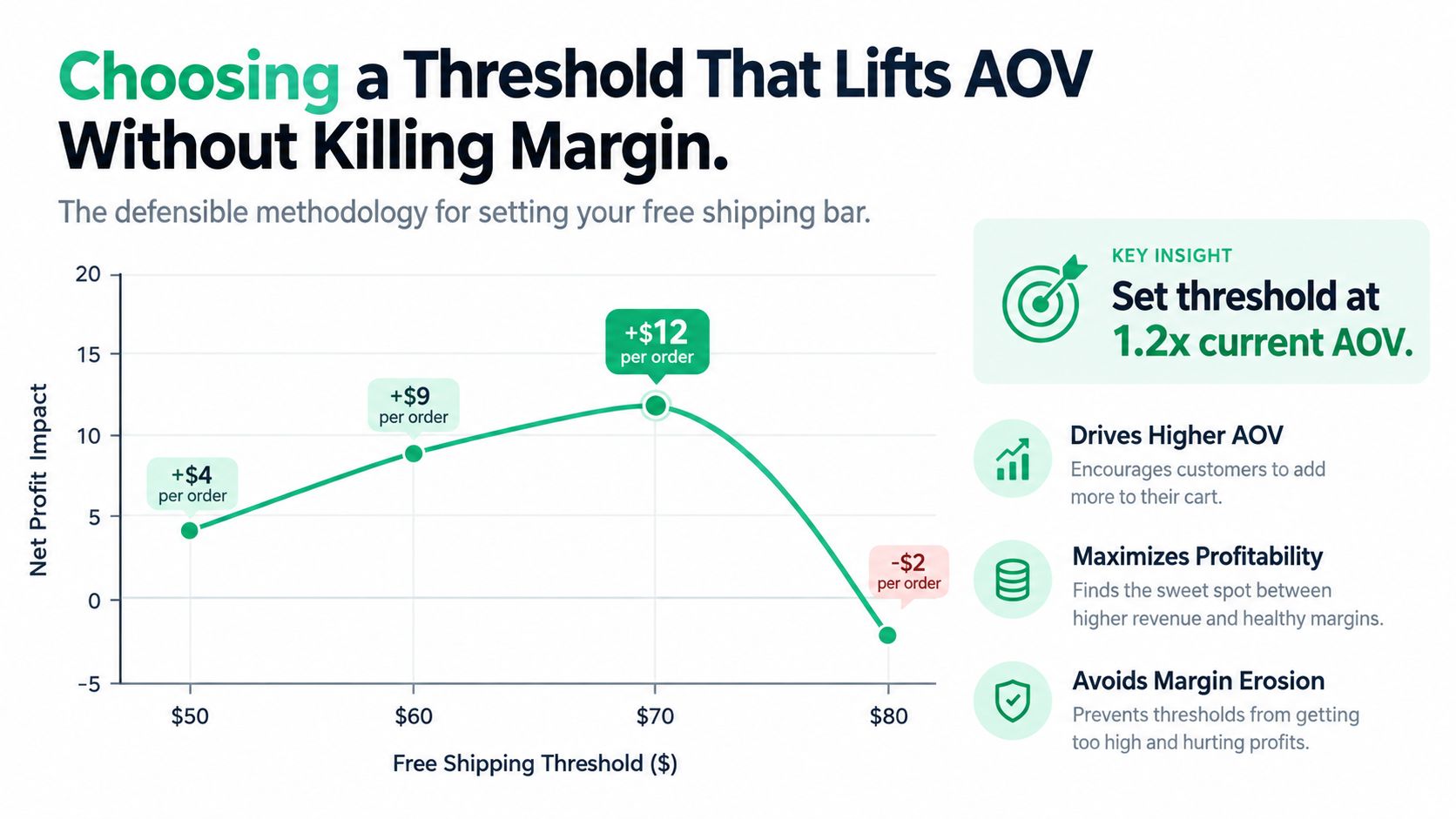
Start with Shopify Analytics AOV, then test thresholds at roughly 15%, 20%, and 25% above that baseline. Track conversion rate, AOV, the share of orders that reach the threshold, and net margin per order after shipping (Shopify free shipping and conversion guidance). That keeps the bar tied to your own economics instead of a generic store template.
The benchmark signal still helps. One 228-store Shopify dataset reported a median free-shipping threshold equal to 80% of AOV, with the middle 50% of stores between 61% and 102% of AOV, which shows many merchants set the bar above the natural basket value rather than below it (threshold benchmark analysis). Because that median sits below a margin-safe test range for many stores, treat 20% to 30% above your own AOV as a starting hypothesis and validate it with your own experiment data. For a structured way to run this, use a free shipping threshold test before you standardize a number.
Best working target: aim for roughly 40% to 60% of orders to qualify. If far fewer do, the bar may feel unreachable. If almost everyone qualifies, you are probably leaving incremental revenue on the table.
A useful internal check is whether the threshold still leaves room after shipping cost and discounting. The bar should raise contribution, not just basket size. For a deeper framing on AOV mechanics, the guide on how to increase average order value in Shopify pairs well with this approach.
The honest version of this work is boring. Test, compare margin, and keep the threshold that improves contribution profit, not just clicks or impressions. A pretty bar that bleeds margin is still a bad bar.
Configuring the Bar in Your Shopify Cart Drawer
The cleanest setup is the one that looks native to the cart, updates instantly, and doesn't make the drawer feel bolted on. I prefer a cart-drawer implementation because it shows the subtotal at the exact moment shoppers are deciding whether to add one more item. When the bar lives there, the math feels immediate.
Wire the progress block to live cart state
In CartServe, the free-shipping goal block sits inside the cart drawer builder, so you can place it with the rest of the cart content instead of layering it through an iframe. Set the threshold as a fixed amount or connect it to a dynamic rule if your pricing logic changes by market or collection. The important part is that the progress calculation updates when the cart changes, not only when the page loads.
Write messaging for three shopper states. If the cart already qualifies, the message should confirm the reward clearly. If the shopper is close, the bar should show the remaining spend. If they've just started, the message should nudge without sounding urgent for no reason. A cart that already qualifies should not be told it still needs work.
Here's the simplest way to think about those states:
| State | Condition | Example message |
|---|---|---|
| Qualified | Cart meets the threshold | Free shipping unlocked |
| Close | Cart is near the threshold | You're $12 away from free shipping |
| Early | Cart is still far from the threshold | Add a few more items to unlock free shipping |
The interface should also respect market-aware previews. If a shopper is browsing in EUR, the bar should not show USD math without explanation. That's one of the easiest ways to lose trust in an international store.
Later in the build, confirm the bar listens to cart mutation events so removing or adding items updates the progress immediately. I've watched too many bars get blamed for “not working” when they were only reading the page once. If you want a broader cart-drawer reference, the internal guide on Shopify cart drawer is useful context.
Where to Place the Bar and How It Behaves on Each Surface
Placement changes the bar's job. Put it in the header and it becomes a broad promise. Put it in the cart drawer and it becomes a live sales tool. Put it at checkout and you're fighting a tighter, less flexible surface.
Match the surface to the moment of intent
A header announcement bar catches people early, before they've committed to anything. That can help with visibility, but it also reads like a promotion and can get ignored. A cart-drawer progress block is more precise because it reads the actual subtotal and responds to live changes, which is where shoppers decide whether to add one more item.
Checkout placement is the most fragile. Most themes and accelerated checkout flows leave less room for customization there, and the shopper is already deep in the purchase path. That's why I rarely treat checkout as the primary home for a free shipping bar unless the platform supports it natively and the implementation is tightly controlled.
On mobile, the bar needs to stay above the line items without pushing the checkout button out of view. On desktop, a slimmer bar is enough. The goal is to guide the decision, not to monopolize the cart. If you're running multi-market traffic, the bar should also soften its wording when the qualifying amount is far away, so the message doesn't feel aggressive to every segment equally.
A simple rule works well here.
Put the bar where the subtotal is visible and the shopper can still act on it.
That's usually the cart drawer. It's also the easiest surface to measure cleanly, since the interaction happens where the threshold is being tested, not after the decision has already been made.
Troubleshooting the Five Problems That Silently Break the Bar
Most broken bars aren't broken at all, they're misconfigured. The shopper sees a bad number, stale progress, or a message that doesn't match the cart, then assumes the store can't be trusted. The fix is usually in the settings, not in a fresh app install.
Read the symptom before changing the tool
If the threshold is too high, qualification will stay frustratingly low and the bar will feel unreachable. The answer isn't to make the message louder, it's to bring the threshold back into a range that shoppers can hit. If the bar still shows old progress after cart edits, it probably isn't listening to cart mutation events, which means the issue is front-end wiring, not merchandising strategy.
Taxes and discounts create another common mismatch. If the bar calculates from one subtotal and the checkout shows another, the shopper notices the gap instantly. Pick one baseline and use it consistently across the cart and the bar. Exclusions create a similar problem when oversized items or subscriptions are allowed to move the progress meter even though they don't qualify in actual shipping rules.
International stores run into currency mismatch next. If the cart is in EUR and the bar displays USD, the whole experience feels off. Market-aware previews and test orders by region are the fastest way to catch that before launch.
| Failure mode | What the shopper sees | Practical fix |
|---|---|---|
| Threshold too high | The goal feels unreachable | Step it down and retest |
| Stale progress | The number doesn't change after edits | Confirm cart-mutation updates |
| Bad subtotal logic | Cart and bar totals disagree | Use one consistent baseline |
| Unclear exclusions | A product doesn't move the bar | Tag and exclude it explicitly |
| Currency mismatch | Wrong market currency appears | Enable market-aware previews |
When a bar underperforms, I look at configuration first and app choice second. That habit saves a lot of wasted rebuilds.
Measuring Results and a 30-Day Improvement Checklist
Don't judge the bar on launch day. Track qualification rate, AOV, conversion rate, and contribution margin per order for at least two weeks before calling anything a win or loss. A bar that lifts basket size but hurts margin is a failure, even if the interface looks clean.
A simple rollout cadence that keeps the work honest
Week one, audit shipping zones, markets, and exclusions. Week two, wire the cart-drawer block and write the three state-based messages. Week three, test thresholds at roughly 15%, 20%, and 25% above AOV. Week four, compare the numbers and standardize the winner.
If you're building a bigger cart stack, the free-shipping bar can sit beside other tools without fighting them. ServeApps also includes a self-service order editor and contextual add-to-cart upsell flows, which can complement the same cart surface if you want to reduce support work while adding revenue. The point is not to overload the drawer, it's to make each part of the cart do one job well.
For a broader check on the abandonment problem the bar is meant to attack, the internal note on Shopify cart abandonment is a helpful companion. It keeps the focus on behavior, not just design.
30-day rule: if the bar can't prove margin-safe improvement within a month of controlled testing, change the threshold or the message before changing the whole stack.
A free shipping bar works when it's treated like a conversion instrument. Keep the shipping logic honest, make the threshold reachable, and wire the cart so the shopper sees real progress at the right moment.
If you want this kind of cart experience built around Shopify-native logic, ServeApps provides cart drawer tooling, self-service order editing, and upsell surfaces that fit into the same flow. Visit ServeApps to see how its cart and post-purchase apps can support a cleaner, more measurable storefront.
Shopify Average Order Value: The Practical Guide
Learn what Shopify average order value really measures, how to calculate it accurately, and which benchmarks actually matter for your store in 2026.
Read more →
Product Recommendations Shopify: Best Practices 2026
Learn how to set up and optimize product recommendations Shopify in 2026. Increase average order value and drive more sales with proven strategies.
Read more →
10 Ecommerce Merchandising Tools for Shopify
Compare 10 ecommerce merchandising tools for Shopify, covering search, personalization, bundles, upsells, cart experiences, and implementation trade-offs.
Read more →