
The loudest advice about a Shopify cart drawer is usually too simple. Merchants hear that a slide-out cart keeps shoppers on the page, reduces friction, and should replace the full cart everywhere. In practice, that's only half the story. A drawer can be a strong conversion surface on desktop and a real liability on mobile if it steals space, slows the page, or buries the checkout button.
Think about the moment a shopper clicks Add to cart. The button changes, the cart count ticks up, maybe a toast appears, and the store feels responsive. That tiny burst of feedback is good. What happens next matters more, though, because the cart UI that opens can either move the buyer forward or introduce hesitation.
A good merchant treats that moment as a test, not a victory lap. The question isn't whether a cart drawer looks modern. The question is whether it helps the shopper finish the order on that device, with that catalog, and with that theme.
Table of Contents
- The Moment a Shopper Hits Add to Cart
- What a Shopify Cart Drawer Actually Is
- Why Stores Switch to a Drawer and What It Costs Them
- The Anatomy of a Cart Drawer That Converts
- Merchandising Inside the Drawer Without Killing Checkout
- How Cart Drawers Get Built in Shopify
- Setting Up a No-Code Drawer and Customizing It
- Choosing the Right Cart Drawer Setup for Your Store
The Moment a Shopper Hits Add to Cart
A shopper taps Add to cart on a product page, and the store gives immediate feedback. The button may flip state, the cart badge may increment, and the drawer may slide in from the right without sending the shopper to a separate page. That sequence feels natural because it preserves context, which is exactly why so many merchants reach for the pattern.
But the best-performing stores don't treat that open drawer as proof that the experience is working. They treat it as the first checkpoint in a longer decision. If the drawer shows the wrong price, hides shipping details, or makes the next step hard to see, the shopper's confidence drops right after the add-to-cart moment.
Practical rule: the add-to-cart interaction should answer one question immediately, “Did my item land in the cart correctly?”
That's where the debate starts. A drawer can reduce browsing interruption, but it can also become a cluttered mini-storefront that asks for more attention than the shopper is willing to give. On desktop, that often feels efficient. On mobile, the same pattern can crowd the screen and disrupt the thumb-friendly flow people expect.
The rest of the decision is device specific. A merchant should ask whether the drawer is helping the shopper confirm, edit, and continue, or whether it is adding one more obstacle between intent and checkout.
What a Shopify Cart Drawer Actually Is
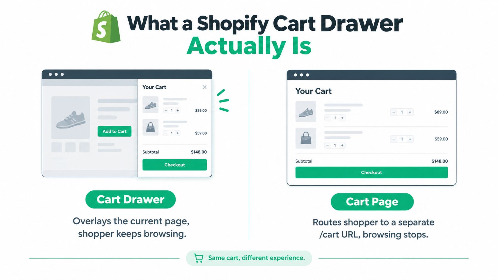
A Shopify cart drawer is a slide-in panel that overlays the current page instead of sending the shopper to a standalone cart URL. The shopper stays in context, keeps the page behind the drawer, and can usually close the panel and continue browsing without a full navigation step.
A running tab at a bar. A cart page is the full receipt handed over at the counter, complete with a separate stop in the flow. A cart drawer is the tab the bartender keeps open while the conversation continues. Same order, different experience.
The two parts that matter
The pattern usually has two structural pieces. First, there's a trigger, often the cart icon or the add-to-cart action. Second, there's the panel itself, which renders the current cart contents through an Ajax request or a theme fragment update.
That distinction matters because a drawer is not just a styling choice. It's a behavior choice. If the trigger fires cleanly and the panel updates fast, the shopper gets a stable cart experience without leaving the page. If either part is fragile, the drawer feels broken even when the product was added correctly.
When evaluating any app or theme, look past the marketing. Ask what happens on open, what happens on quantity change, and what happens when the shopper closes the panel and returns to browsing. That mental model will save you from choosing a drawer that looks polished but behaves unpredictably.
Why Stores Switch to a Drawer and What It Costs Them
A cart drawer is not automatically a conversion improvement. It can keep desktop shoppers in the browsing flow, yet create a cramped, slower checkout path on mobile. The right choice depends on the device, theme, traffic mix, and how much code the drawer adds.
Merchants usually choose drawers to reduce hard page transitions between product discovery and checkout. Independent ecommerce guidance reports that replacing a default cart page with a drawer can raise cart-to-checkout conversion by 5% to 12% CartyLabs cart drawer guide. A widely cited 2026 benchmark reported a 3.2x versus 2.2x revenue multiplier before checkout, plus a +17% desktop lift versus -8.4% on mobile, for optimized drawers compared with default cart pages cart page vs cart drawer benchmark.
That contrast changes how a merchant should evaluate the feature. Desktop shoppers have more room for cart details, recommendations, and checkout controls. Mobile shoppers have less screen space and are more likely to lose sight of the primary button when extra modules expand the panel.
A drawer can also slow the product page before anyone opens it. Independent audits estimate that a typical drawer adds 20–60 KB of JavaScript and 8–25 KB of CSS before app code, affecting metrics such as Interaction to Next Paint and Total Blocking Time cart drawer loading audit. Loading those assets too early can turn a supposedly lighter cart into a slower shopping experience.
Theme app extensions help reduce the risks created by custom code. They give apps defined insertion points within the theme, making layout integration easier to manage and reducing the need to edit core theme files. They do not remove performance work, though. The extension still needs compact markup, delayed loading where appropriate, and testing across real mobile devices.
| Metric | Desktop with Drawer | Mobile with Drawer |
|---|---|---|
| Browsing continuity | Usually strong | Helpful when compact |
| Checkout visibility | Easier to preserve | Easily pushed below the fold |
| Performance sensitivity | Moderate | High on slower devices |
| Conversion outcome | Often positive when optimized | Can decline when crowded |
Treat the drawer as a device-specific optimization, not a default winner. For practical ways to reduce friction after the cart, see this guide on reducing Shopify checkout friction.
The Anatomy of a Cart Drawer That Converts
A drawer converts when it answers the shopper's questions in the right order. The first job is confirmation, not persuasion. The second job is editing, not upselling. Only after that should the drawer start nudging the buyer toward more value.
Start with clarity, then preserve the path to checkout
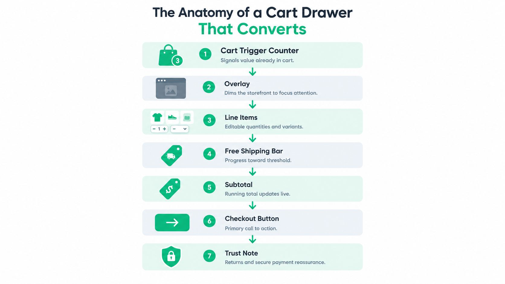
The cart trigger counter matters because it signals that value has already been added. The overlay matters because it dims the storefront and tells the shopper, “focus here for a moment.” The line items matter because the buyer needs to see the product image, variant, quantity, and price without hunting.
On mobile, those pieces need restraint. Quantity steppers should be thumb-sized, images should stay compact, and line items should not consume the whole screen. If the drawer feels like a full page squeezed into a panel, it stops behaving like a drawer.
Keep the decision surface narrow
A strong drawer usually shows the shipping threshold, the subtotal, and the primary checkout button with the most visual weight. If the shopper needs to enter a discount code, that field should feel available without taking over the layout. Inline notes and attribute editors are useful when they prevent a future support ticket, but they should stay out of the way unless the shopper needs them.
Good drawer design is subtraction, not decoration.
Here's the order that tends to work: cart count, overlay, line items, shipping signal, subtotal, checkout. Trust copy fits near the bottom, where it reassures without interrupting the path. A drawer that follows that structure feels calm because each block has a job, and none of them competes with the next click.
Merchandising Inside the Drawer Without Killing Checkout
A lot of merchants assume the drawer should carry as many offers as possible. More upsells, more banners, more prompts, more progress bars. That sounds revenue-positive until you watch the shopper hesitate in real time. Every extra module creates one more decision before checkout, and the drawer is already a decision surface.
Independent UX guidance says stores can leave 5% to 15% of cart-to-checkout conversion on the table when they rely on weak CTA hierarchy, unclear pricing, or competing actions cart drawer UX guidance. That doesn't mean you should never merchandise inside the drawer. It means merchandising has to behave like a guardrail, not a carnival.
Use one module to resolve one hesitation
The cleanest drawers usually do three things well. They keep one primary checkout CTA visible. They use a free-shipping progress cue when shipping thresholds matter. They place upsells below the line items, not above the button, so the shopper never mistakes a recommendation for the next required step.
If you want a contextual recommendation, show one, not a carousel. If you want to reinforce progress, make the bar slim enough that it doesn't shove the CTA below the fold on small phones. If you want to add a promotion, make sure it helps the shopper decide rather than asking them to renegotiate the cart.
For a deeper framework on what belongs in a cart offer flow, see this guide to Shopify upsell and cross-sell strategy.
The best drawers are deliberate. They answer the buyer's immediate questions, then get out of the way.
How Cart Drawers Get Built in Shopify
There are three common ways to build a drawer in Shopify, and they carry very different maintenance costs. The oldest route is direct theme edits. That gives a developer complete control, but it also ties the drawer to theme files that may need rework every time the theme updates. The drawer can inherit whatever performance issues the theme already has.
The second route is script-tag injection. That used to be the standard for many apps, and it's still common in older implementations. The problem is that it loads extra JavaScript on every page, then mounts the drawer after first paint. That can create visible layout shift, which is exactly the kind of instability shoppers feel even if they never name it.
The third route is a theme app extension. This is the cleanest pattern for most stores because it renders through the theme editor, ships structured markup, and only loads where the block is placed. That keeps the feature editable without digging into Liquid every time the merchant wants to tweak the cart.
If the drawer needs global scripts to exist, it's already making the site work harder than it should.
| Approach | Setup effort | Performance impact | CLS risk | Theme update safety | Merchant editability |
|---|---|---|---|---|---|
| Theme code | High | Depends on theme quality | Moderate to high | Low | Low |
| Script tag | Moderate | Usually broader page cost | High | Moderate | Moderate |
| Theme app extension | Lower after install | More contained | Lower | High | High |
If you're comparing app wiring patterns across your stack, this Shopify app integration guide is a useful companion.
Setting Up a No-Code Drawer and Customizing It
A no-code drawer starts with a Shopify app that ships as a theme app extension. In practice, that means you install the app, open the theme editor, and place the drawer block where the theme supports it. Once it's in place, the drawer should be adjustable without touching Liquid.

What merchants usually change first
Branding controls matter before merchandising does. Drawer width, typography, button color, and corner radius should match the storefront closely enough that the panel feels native. If the drawer looks bolted on, shoppers notice the break in experience before they notice any offer.
Block-based layouts usually let you add or hide cart line items, subtotal rows, shipping thresholds, and recommended products. That flexibility is valuable, but the key win is control. You can reorder modules without reopening code, and you can test what belongs above or below the CTA.
The settings that deserve the most attention are the ones that affect flow. Free-shipping progress should reflect the markets you sell into. The sticky checkout button should stay visible on mobile. Currency and market-aware previews help you avoid shipping a drawer that looks right in one region and wrong in another.
CartServe, a ServeApps app, is one example of this no-code pattern. It offers drag-and-drop blocks, rewards and free-shipping goals, and market-aware previews inside a Shopify theme app extension.
The safest rollout is boring on purpose. Preview the drawer in a draft theme, then test it on product pages, quick views, and AJAX add-to-cart buttons before you turn it on for every shopper. A drawer that works in one entry point but breaks in another will cost you more in support than it saves in friction.
Choosing the Right Cart Drawer Setup for Your Store
The right setup depends on three things, your device mix, your catalog complexity, and your technical resources. A mobile-heavy store with simple products usually benefits from a compact no-code drawer built through a theme app extension. A catalog with B2B pricing, bundles, or heavy merchandising often needs deeper control at the theme or Liquid layer.
A full cart page still makes sense when the product journey needs more reading before checkout, or when desktop and mobile behave so differently that a drawer creates more inconsistency than lift. Low mobile share also changes the math. If most of your traffic already converts well through a cart page, a drawer can become a distraction instead of an upgrade.
| Store Profile | Recommended Setup | Key Reason | Watch Out For |
|---|---|---|---|
| Mobile-heavy DTC catalog | No-code theme app extension | Fast to ship, easier to keep compact | Over-merchandising on small screens |
| Complex bundles or B2B | Custom Liquid or hybrid build | Better control over rules and layout | Maintenance overhead |
| Lean catalog with strong PDPs | Keep the cart page or test a light drawer | Fewer moving parts | Changing a working funnel without evidence |
| Merchants without dev support | No-code drawer | Easier editing after launch | Blocking checkout visibility |
The cleanest first step is simple. Enable a no-code drawer, measure cart-to-checkout completion by device for two weeks, and compare the result against your current cart page. If the drawer helps desktop but hurts mobile, don't average the two together and call it a win. Split the decision by device and let the data decide whether you keep the drawer, customize it further, or go back to the full cart page.
ServeApps builds Shopify-native tools for cart drawers, upsells, and post-purchase operations, so merchants can ship these kinds of changes without leaning on brittle custom code. If you're comparing drawer setups, ServeApps is a practical place to look at theme app extension workflows, market-aware cart editing, and no-code merchandising blocks in one stack.
Shopify Average Order Value: The Practical Guide
Learn what Shopify average order value really measures, how to calculate it accurately, and which benchmarks actually matter for your store in 2026.
Read more →
Product Recommendations Shopify: Best Practices 2026
Learn how to set up and optimize product recommendations Shopify in 2026. Increase average order value and drive more sales with proven strategies.
Read more →
Free Shipping Bar Shopify: How to Set One Up That Works
Free Shipping Bar Shopify. Learn how to set up a free shipping bar in Shopify that converts. Covers thresholds, messaging, placement, and currency tips
Read more →