

What separates a high-converting checkout from a page that only looks polished? A clean layout can still hide surprise fees, a long form, or no way to fix a wrong size after someone pays. Baymard Institute's compilation of 50 studies puts the average abandonment rate at 70.19%, about 7 in 10 carts that never become orders, and that benchmark has stayed broadly stable across 14 years of tracking.
Pretty checkout examples are easy to collect and hard to use. The seven resources below are judged on the decision behind each pattern, the friction they target, and a test you can run on your own Shopify store. Research libraries, merchant write-ups, and experiment archives do different jobs. Treat them that way.
Table of Contents
- 1. Baymard Institute, Checkout Design Examples
- 2. Baymard Institute, Ecommerce Design Examples Library
- 3. Shopify, Checkout Page Design Tips and Examples
- 4. Cartylabs, 100 Shopify Checkout Examples
- 5. Skai Lama, Top Shopify Checkout Examples You Can Copy
- 6. LiftArchive, Checkout Examples with Reported Test Results
- 7. Shopify, How to Customize Shopify Checkout
- Comparing the Checkout Example Resources
- From Checkout Examples to Your Own Test Roadmap
1. Baymard Institute, Checkout Design Examples
Baymard Institute's checkout usability library is the place I start when a team argues about one step instead of the whole funnel. It holds more than 7,500 checkout-step examples across 16 types, from cart and cross-sells through shipping, payment, guest checkout, and order confirmation.
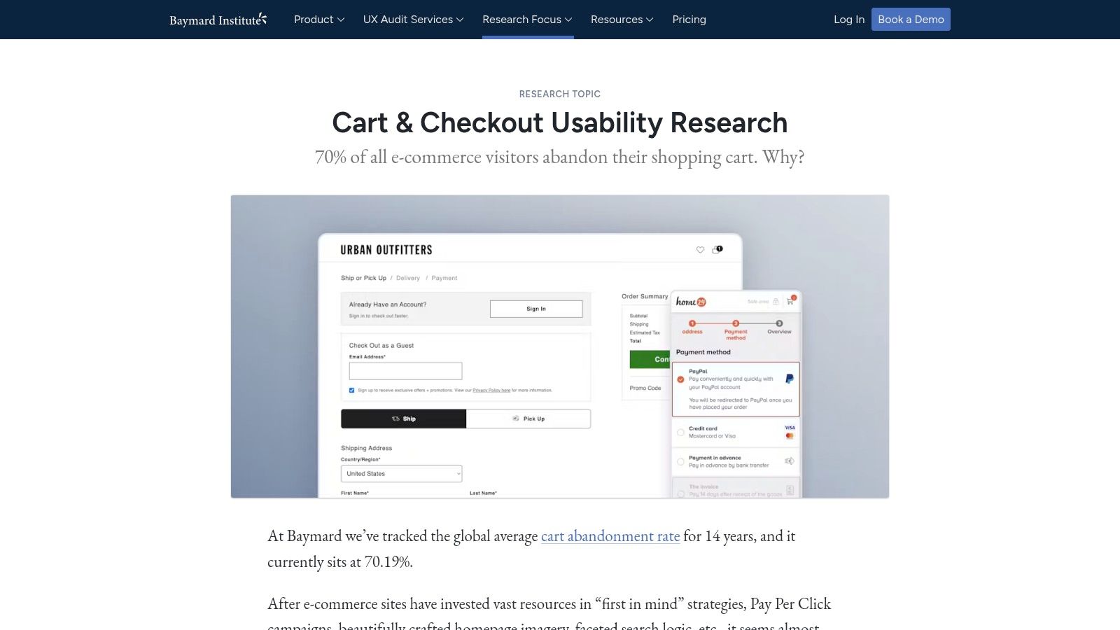
Categorized examples are labeled free. Deeper benchmark research is paid. That split matters. You can compare how stores handle a stuck field without buying a report, then pay only when you need the annotated finding.
What to copy, and what to skip:
- Copy the slice, not the gallery. Pull desktop, mobile, and app treatments of one problem, such as address entry or guest checkout.
- Read the annotation before the screenshot. The note tells you which behavior failed, not which brand looks premium.
- Skip aimless browsing. The breadth turns into a research project if you don't name the friction first.
Practical rule: Pick one failing step from your own analytics, then compare only that step across three stores before you redesign anything.
The trade-off is speed versus rigor. This library won't hand you a theme setting. It will stop you from "fixing" payment when the actual drop is shipping.
2. Baymard Institute, Ecommerce Design Examples Library
Checkout rarely fails in isolation. A cross-sell that hides the total, or a cart that won't show delivery, sets up the abandonment you later blame on the payment page. The ecommerce design examples library is the wider shelf: more than 18,000 examples across 76 page types, including cart, cross-sells, checkout steps, and confirmations.
Baymard's checkout benchmark says the average large site could see a 35.26% increase in conversion from checkout design alone, based on 272 moderated sessions, eye tracking, 850+ evaluated steps, and nine studies with 11,777 participants. The same work argues an effective checkout can shrink to about 12 form elements: seven fields, two checkboxes, two dropdowns, and one radio group.
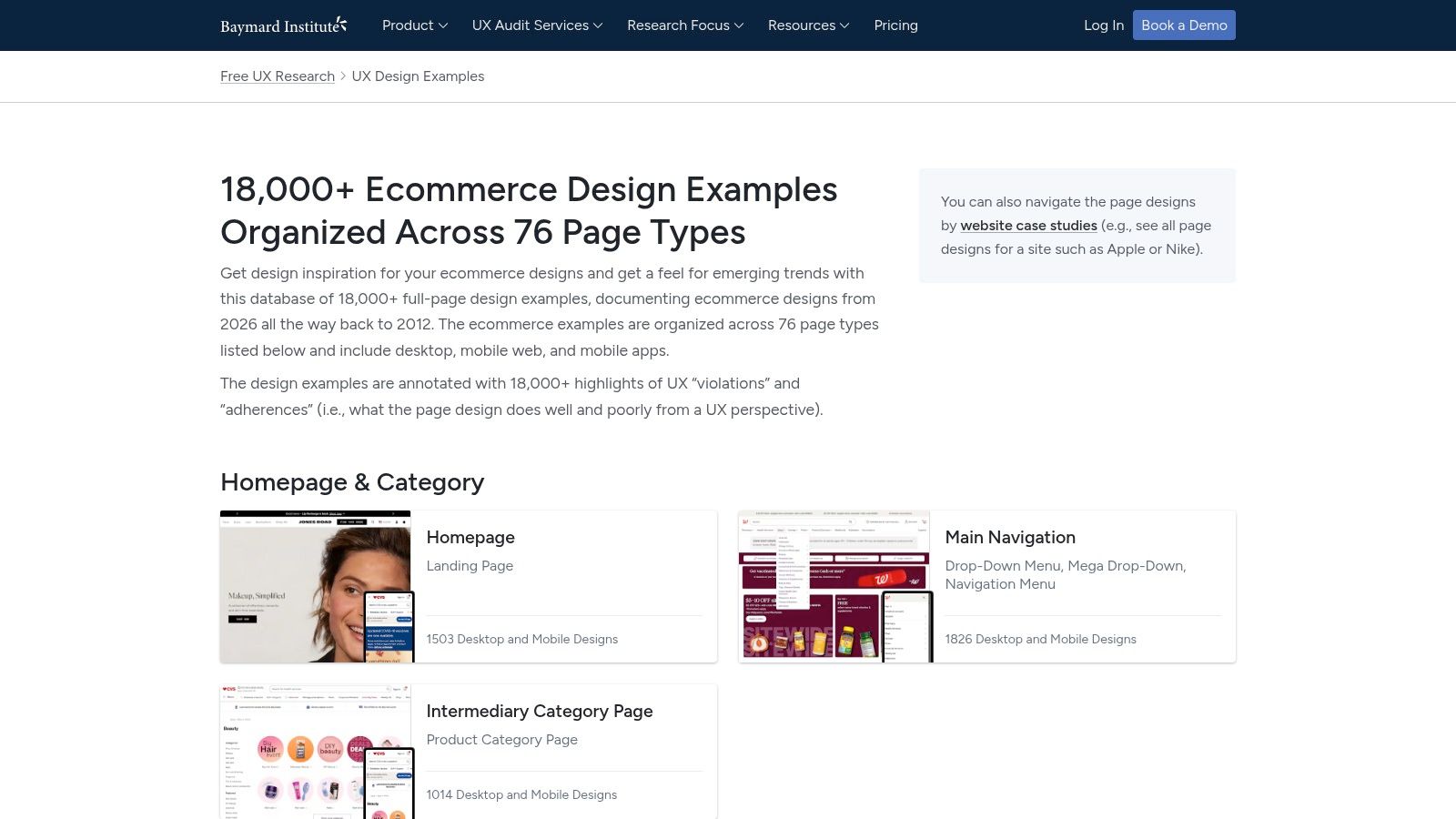
Use that 12-element target as a hypothesis, not a promise. Show shipping cost next to the control that changes it. Keep saved address and payment data recognizable. Don't drop tax, returns, or security copy just to hit a lower field count.
Browsing access varies, and full research is paid. This is inspiration and diagnosis, not a Shopify build guide. I use it to see whether the cart, the offer, and the confirmation tell the same story.
3. Shopify, Checkout Page Design Tips and Examples
Shopify's free checkout page design guide is short on volume and clear on decisions. It walks through Allbirds, Glossier, and Happy Socks, then ties each screen to a pattern: express checkout, a visible order total, delivery versus pickup, and a tabbed single-page flow.
Say your returning buyers already have a wallet on file, and new buyers don't. Those groups should not share one success metric. In Shopify's Princess Polly write-up, Shop Pay cut store-wide median checkout time by 7.6% over four weeks and lifted conversion 4.1% among shoppers who already had a Shop Pay session, by recognizing them and prefilling details. The same piece notes Alice + Olivia Shop Pay orders at a $487 average order value and 35% of orders. Those are case outcomes, not a forecast for your catalog.
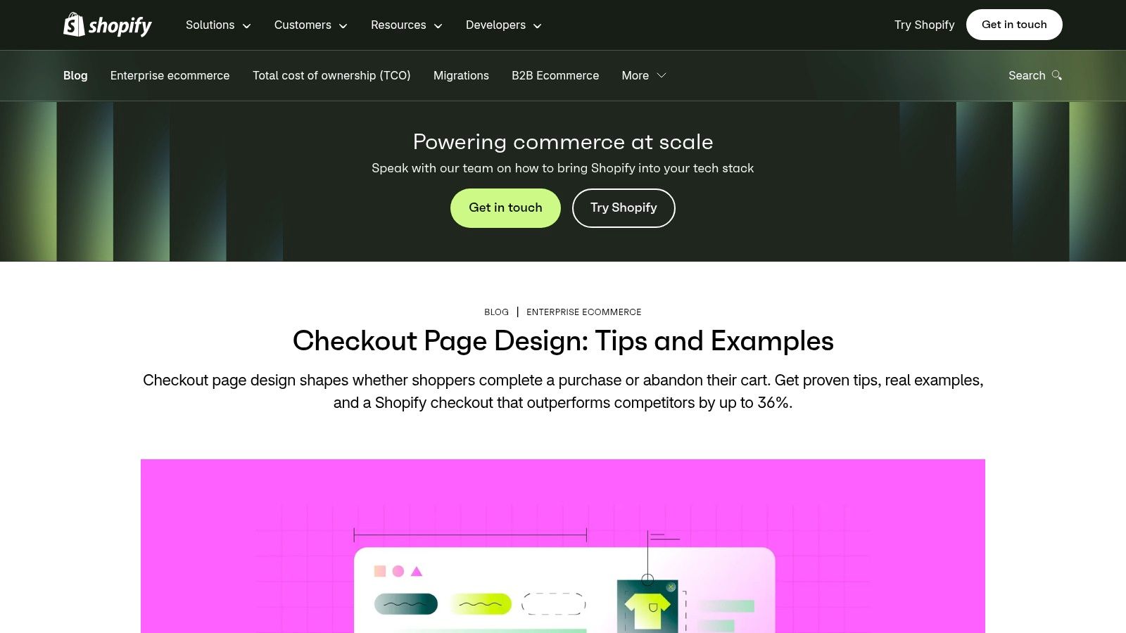
How I'd use the three brands:
- Express pay first for known buyers. Measure authenticated and guest cohorts apart.
- Totals before the pay button. Shipping, tax, and fees belong where the choice is made.
- One page with clear sections. Tabs help only if each section still shows what's left.
Live checkouts change, and three stores aren't a benchmark. If you need to know what Shopify will let you change, pair this read with a look at Shopify checkout extensibility before the design review turns into a build plan.
4. Cartylabs, 100 Shopify Checkout Examples
Cartylabs' pattern set is the Shopify-native counterweight to a general UX library. It groups 100 free examples across cart drawers, checkout information, shipping and payment, branding, order-status pages, and B2B. The useful cluster for most brands is merchandising: free-shipping progress, spend-tier gifts, and product offers.
Almost 40% of U.S. consumers abandoned an online purchase during checkout in 2025 because of extra costs such as shipping, taxes, or fees, according to Statista's read of consumer survey data. A progress bar doesn't remove that cost. It tells the shopper what closes the gap before they hit the fee.
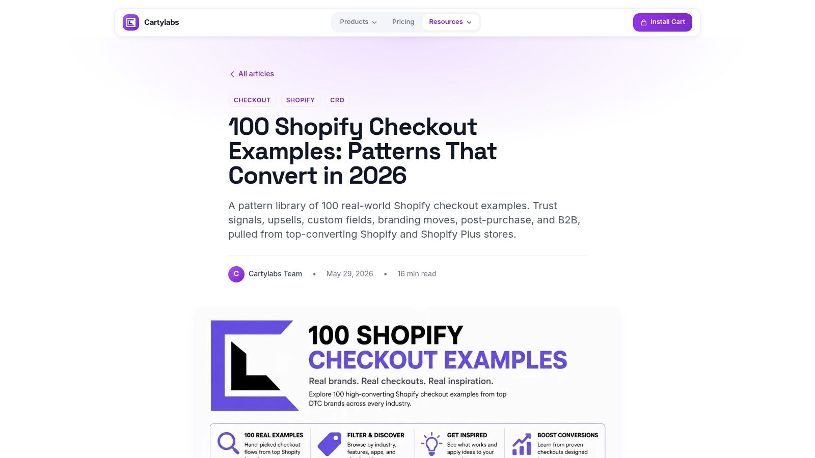
A cart drawer that sells harder than it informs will raise add-to-carts and still lose the order at shipping.
Treat every pattern as a candidate, not proof. Some need a certain Shopify plan or an app. I pull one pre-checkout idea and one order-status idea, then ignore the other 98 until those two have a result. Summaries like this won't tell you error rate or time to purchase. Your analytics have to.
5. Skai Lama, Top Shopify Checkout Examples You Can Copy
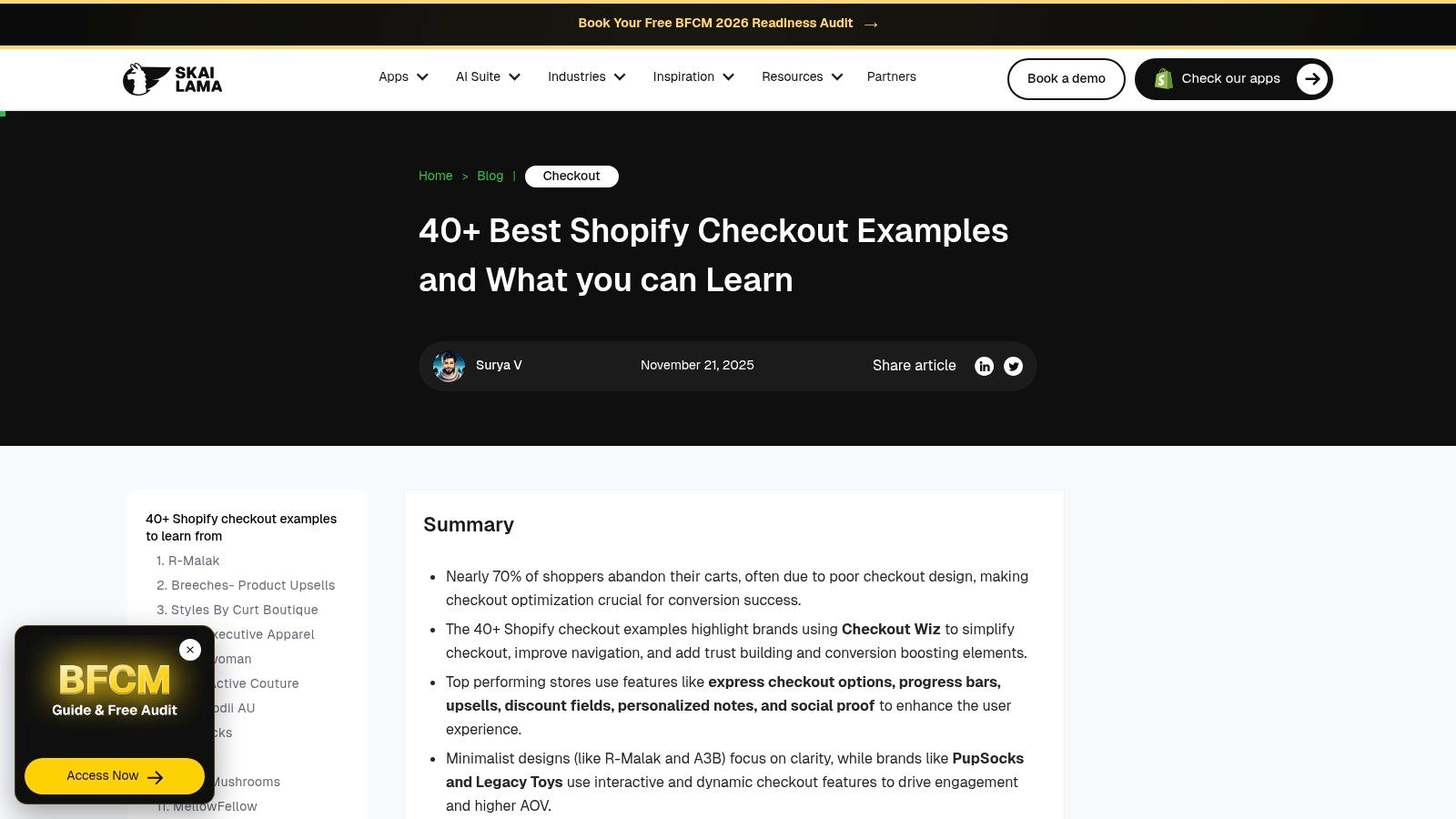
Skai Lama's roundup collects more than 40 Shopify checkouts: express wallets, progress indicators, shipping transparency, discount fields, cross-sells, and gifts. The stores use Skai Lama's Checkout Wiz app, so you're reading a vendor's gallery. That's fine if you price the bias in before you copy a block.
Baymard's current checkout research reports that 17% of shoppers abandoned a purchase in the prior three months because checkout was too long or complex, and that the average U.S. checkout still holds 23.48 form elements against an ideal near 12 to 14. Cutting fields is not automatically the win. Strip out duties, delivery dates, or payment security and you trade length for doubt, especially across currencies and address formats.
Keep versus cut:
- Keep a progress cue and a shipping line the shopper can see before pay.
- Keep one discount field, not a stack of promo, gift card, and loyalty boxes fighting the total.
- Cut a cross-sell that pushes the pay button below the fold on mobile.
Some patterns need Shopify Plus or a third-party tool. Read the recommendation as a prompt, then check whether your plan can ship it without a custom detour.
6. LiftArchive, Checkout Examples with Reported Test Results
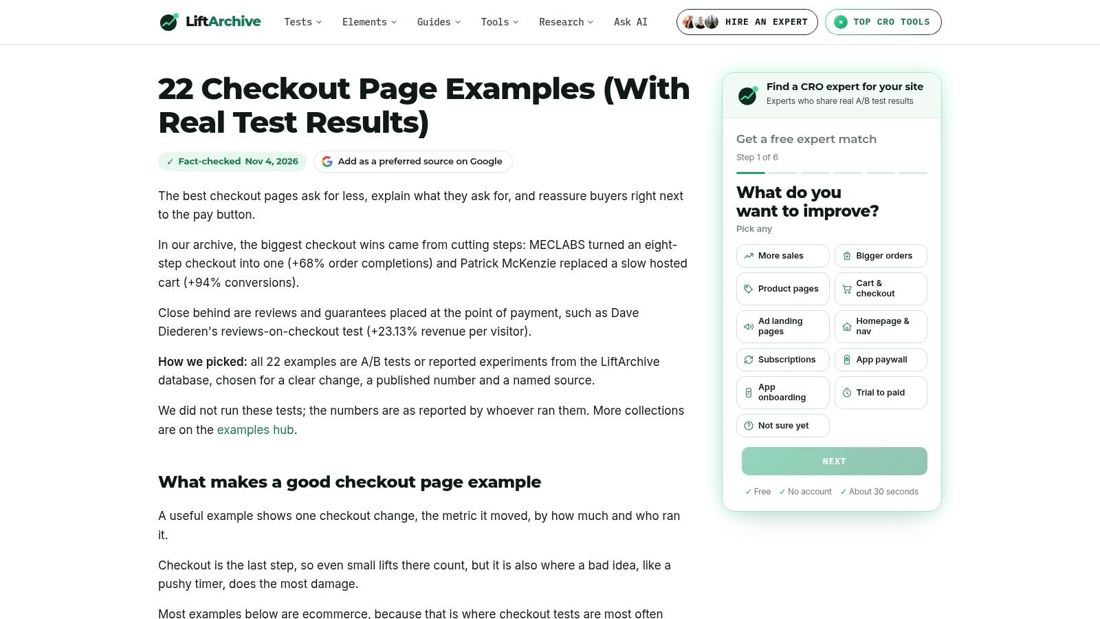
Visual libraries tell you what exists. LiftArchive tells you what someone measured. It lists 22 checkout experiments, free to browse, covering simpler steps, different field handling, and reassurance, across ecommerce, subscription, software, and app flows. Results include wins, losses, and mixes.
That mix is the point. A field removal that lifted one catalog can hurt a store where buyers need the tax line before they'll pay. I don't import the percentage. I import the change, the audience, and whether the write-up even describes the control.
A hypothesis worth running has four parts:
- The change: one step, one field rule, or one trust cue.
- The segment: guest versus returning, or mobile versus desktop.
- The metric pair: completion rate and time to purchase, not conversion alone.
- The stop rule: what result sends you back, including a flat or negative read.
Most of these tests aren't Shopify-specific, and a listing can't replace the original design. For a tighter pass on page structure before you brief a test, the notes in what makes a checkout page convert are a useful filter. Then run the idea on your traffic.
7. Shopify, How to Customize Shopify Checkout
Inspiration dies at the plan gate. Shopify's customization guide is the feasibility check: which personalization paths exist, which brand examples illustrate them, and which capabilities depend on plan, app, or an extension. It isn't a screenshot library, and the examples show possibilities, not guaranteed lifts.
The decision I care about here isn't the hero color. It's reversibility. A short, rigid pay step can still be the right checkout if the shopper can correct a size, an address, or a variant before fulfillment, with a clear window and a clean way to collect or refund the difference. Stuffing those fixes into the first form only lengthens the page everyone already wants to leave.
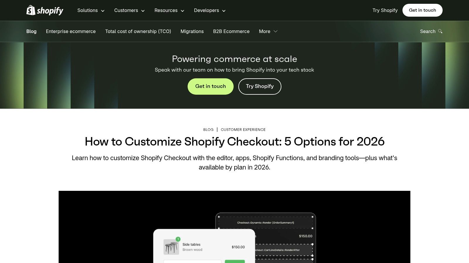
Map each borrowed idea to a path before it hits the roadmap. Branding and content blocks are not the same project as a new payment method. If you're weighing cost cues in the cart, look at how other merchants explain free shipping minimums on jewelry orders, then decide whether that threshold belongs in the drawer, the shipping step, or both.
Teams comparing build options should read how Shopify checkout customization actually works before promising a stakeholder a layout checkout won't allow. Rules change. The guide's job is to surface that question early.
Comparing the Checkout Example Resources
| Resource | Number of Examples | Best For | Cost to Access | Shopify-Specific |
|---|---|---|---|---|
| Baymard Institute, Checkout Design Examples | More than 7,500 | Researching checkout steps and UX patterns | Categorized examples free; deeper research paid | No |
| Baymard Institute, Ecommerce Design Examples Library | More than 18,000 | Exploring checkout in the wider ecommerce journey | Access varies; full research access paid | No |
| Shopify, Checkout Page Design: Tips and Examples | A small number; three named stores | Practical checkout design guidance for merchants | Free | Yes |
| Cartylabs, 100 Shopify Checkout Examples | 100 | Shopify checkout, cart merchandising, and upsell inspiration | Free | Yes |
| Skai Lama, Top Shopify Checkout Examples You Can Copy | More than 40 | Shopify checkout customization patterns | Free | Yes; examples use the publisher's app |
| LiftArchive, Checkout Examples with Reported Test Results | 22 | Developing checkout experiment hypotheses | Free to browse | No; examples span multiple industries |
| Shopify, How to Customize Shopify Checkout | Count not stated; includes brand examples | Understanding Shopify checkout customization and feasibility | Free | Yes |
From Checkout Examples to Your Own Test Roadmap
Use the two Baymard libraries to name the friction, Cartylabs and Skai Lama to draft Shopify-shaped ideas, and LiftArchive to decide which idea deserves traffic. Shopify's two guides tell you whether the idea is even buildable. Copy the decision, not the screenshot. Show cost when it changes. Cut fields only when the disclosure still holds. Separate guest results from returning buyers. And don't treat payment as the end of the order if a size or address fix is still cheap.
On Shopify, several of those patterns don't need a custom checkout rebuild. Our apps SelfServe, CartServe, and UpServe cover cart-drawer merchandising and post-purchase offers, with setup we say takes under 10 minutes. Any Online Store 2.0 theme works out of the box, and the cart drawer can be previewed against real products, an empty cart, and a market's currency before you publish. SelfServe sits on the order status page so customers can edit within rules you set, which is the reversibility test the prettiest pay button never shows.
Start with one cart pattern and one post-purchase edit rule. Measure completion, support tickets, and average order value for two weeks. Then add the next idea only if the first one moved a number you already track.
ServeApps builds Shopify apps for the cart and the order after payment, so the patterns in these checkout examples can ship as a cart drawer, an add-to-cart offer, or a self-serve edit instead of a custom theme project. If you want that stack on your store, book a demo or start a free trial with ServeApps.
What Is Upsell? Examples and How Shopify Stores Use It
What is upsell? Learn the definition, how it differs from cross-selling, and how Shopify stores use upsells to raise order value.
Read more →
Increase Conversion Rate on Website: 9 Proven Cart Tactics
Increase conversion rate on website with cart, upsell, and testing tactics. See what lifts AOV, cuts abandonment, and how to apply each one today.
Read more →
8 Self Service Store Examples: Benefits and Tactics
Explore 8 self service store examples, from cashierless checkout to post-purchase portals, with benefits, trade-offs, and tactics you can copy.
Read more →