

The most popular advice on header images is also the most misleading. You're told to export one file, usually 1920×600 px, upload it everywhere, and trust your theme to handle the rest. That file might look fine on your laptop. On a phone, it can crop off the product, shrink the headline into the photo, and force every visitor to download desktop pixels they'll never see.
There's no universal Image Size for Website Header. The useful spec has four parts, the display width in your layout, a separate mobile crop, a focal point that survives cropping, and a delivery choice based on whether that image is the first big thing the browser paints. Get those four right and the exact pixel number becomes a sensible export decision, not a guess copied from a chart.
Table of Contents
- Recommended Image Sizes for Website Headers
- Mobile Widths That Break a Desktop Banner
- Formats and File Weights Worth Shipping
- How to Build the Header Image Files
- Fix Slow or Jumpy Headers and Run the Release Check
Recommended Image Sizes for Website Headers
Start with the sizes you can export today, then treat them as starting points tied to a job, not as laws. 1920×600 px is a convention, not a rule. A short promotional banner, a full-screen hero, and a slim announcement strip don't occupy the same space, so they shouldn't start from the same canvas.
Website header export sizes
| Header job | Desktop source | Mobile crop | Shape | Export note |
|---|---|---|---|---|
| Short banner | 1600×500 px | 800×400 px | 3.2:1 desktop, 2:1 mobile | Center the subject; a very short crop hides faces on phones |
| Full-screen hero | 1920×1080 px | 800×1200 px | 16:9 desktop, 2:3 mobile | Art-direct two files; do not only scale the desktop hero |
| Article or campaign header | 1200×630 px | 800×420 px | 1.9:1 | Useful when the same image also works as a social preview |
| Slim announcement strip | 1920×400 px | 800×300 px | 4.8:1 desktop, 8:3 mobile | Keep type and products out of the outer edges |
| Retina master | 2560 to 3840 px wide | Do not send this file | 16:9 or the banner ratio | Publish width variants instead of one giant file |
How to pick a row
Pick the row by the header's job. If the header sits above a short offer and a button, the 1600×500 px banner gives you enough width without inventing height you don't need. If the photo fills the first screen, use the 1920×1080 px hero on desktop and make the 800×1200 px portrait version for phones. Shopify's guide to persuasive hero images supports that art-directed approach, with a desktop asset around 1600×500 px for a short banner or 1920×1080 px for a full-screen hero and a separate portrait mobile crop around 800×1200 px.
An article or campaign header at 1200×630 px earns its place when you want one composition to work on the page and as a preview elsewhere. A slim strip at 1920×400 px works when the layout is shallow, but it's the easiest shape to break on mobile. The browser either shrinks it until the type is tiny or crops the sides to fill a taller slot.
For sharpness, build your master at about twice the widest CSS display width. That's often 2560 to 3840 px wide in practice. Don't ship that master. Export smaller width variants from it and let each device take the file closest to its slot. A master is your editing safety margin, not your published asset.
If your products rely on lifestyle photography, a photo workflow for mattress retailers is a useful companion read on preparing product shots before compression, because a clean, well-lit source survives resizing far better than a dark, noisy one.
Where the subject must sit
Keep the product, face, or headline background inside a central safe zone. A phone crop removes far more of the left and right edges than a desktop layout does. If your product sits at the far left because it balances a headline on the right, the phone version can lose one of them. That's not a resizing problem. It's a composition problem.
Practical rule: If removing the outer third on each side would remove the product, a face, or a word, you don't have a responsive header yet. You have a desktop poster.
After you pick a row, preview at 375, 414, and 428 CSS pixels plus one desktop viewport. Check that buttons don't sit on a face, that product edges aren't clipped, and that text baked into the image, which you should avoid where possible, stays readable. A theme that only scales the desktop file won't fix a composition that only works at 1920 px.
This matters beyond the homepage. Header and banner choices affect how shoppers read collections, offers, and product groupings, which is why image sizing belongs in the same conversation as merchandising for ecommerce. A cropped product isn't just ugly. It tells the shopper the wrong story about what you're selling.
Say a skincare store runs a wide desktop hero with the bottle on the left and copy on the right. On a phone, keep the bottle and build a portrait crop with the bottle centered and the headline as live text above or below it. You'll get a stronger phone header than any automatic crop will give you.
Mobile Widths That Break a Desktop Banner
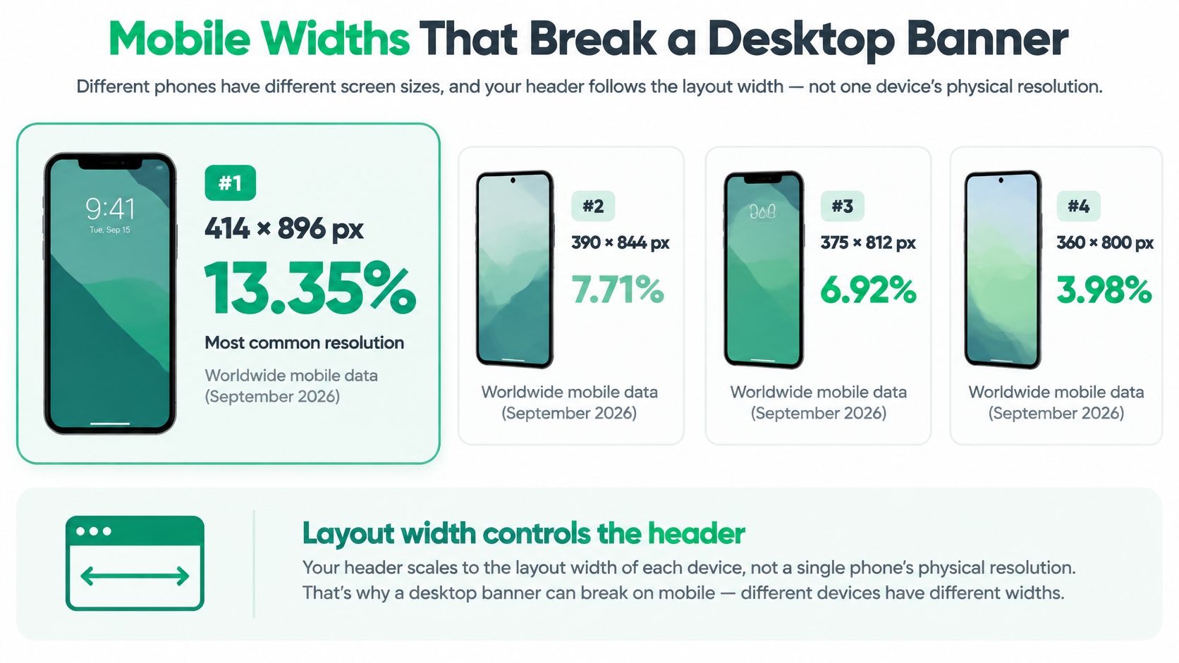
A desktop banner can look sharp and still fail on a phone. Header images need to fit the layout width, which is measured in CSS pixels, not the phone's physical screen resolution. A responsive setup should serve a suitable image width and crop for each layout.
StatCounter's worldwide mobile screen-resolution page displays a changing breakdown of mobile screen resolutions. Use it as a reference for the range of screens visitors may use, not as a fixed list of the most common phone widths.
The widths you should actually check
Test the layout at several CSS widths in your design tool and browser:
- Narrow phones: check around 360 to 390 CSS pixels, where side cropping can become noticeable first.
- Wider phones: check around 414 CSS pixels. A composition that works here may still fail on narrower screens.
- Laptop and wide desktop: check your usual content width and a full-bleed window to catch upscaling or awkward empty edges.
Start with the narrow phone layout if the header features a product or headline. These checks belong in broader mobile optimization work for Shopify stores, since the header is often the first layout a mobile shopper sees.
Why sharpness needs variants, not one giant file
A screen with a 390 CSS pixel layout may need an image roughly twice as wide in source pixels to look sharp. Device pixel ratio accounts for the difference between the browser's layout width and the screen's physical pixels. Serve a sharper, appropriately sized variant where needed, rather than sending every phone a large desktop image.
Match the file to the slot: a narrow phone needs a narrow image, while a desktop needs a wider one. A single oversized export makes mobile visitors download pixels intended for larger screens.
How cropping changes the picture
With object-fit: cover, the browser enlarges an image until it fills its box, then trims the overflow. A shallow desktop crop can lose a product when placed in a taller phone slot.
A tall mobile crop reveals more of the image vertically and can change what draws attention. A minor desktop background detail may become prominent, or a headline that sits over a calm area on desktop may overlap a busy part of the mobile image.
Keep text and buttons inside a safe area, and create two compositions when a headline, face, or product would fall into the crop. That extra design work prevents the mobile header from losing the subject that makes the image clear.
Formats and File Weights Worth Shipping
Format is part of the size decision. Two images can share the same pixel dimensions and weigh very differently, and the heavier one isn't always the one that looks better. If you only ask how wide the header should be, you're ignoring half of what the visitor downloads.
The 2025 Web Almanac performance report reports JPEG on 57% of desktop pages, PNG on 26%, and WebP on 11%, while noting that WebP and AVIF generally provide better compression than legacy formats. Popularity and efficiency aren't the same thing. JPEG leads because it's old and compatible, not because it's the best choice for a new header.
Header image formats compared
| Format | Desktop pages in 2025 | Use it for | Avoid it when |
|---|---|---|---|
| JPEG | 57% | Photo fallback where WebP is not served | It is the only file and is far wider than the phone slot |
| PNG | 26% | Logos, flat graphics, or hard-edged transparency | The header is a photograph, because PNG files stay heavy |
| WebP | 11% | Default photographic banner or hero | You need a fallback and have not provided one |
| AVIF | Not listed among those three | Smallest photo hero when encoding is acceptable | Older clients have no JPEG or WebP alternative |
A sensible default order
Use WebP as the default for a photographic header. Add AVIF when your encoder produces clean results and you have a fallback path for clients that can't use it. Keep JPEG as the compatibility fallback. Reserve PNG for flat graphics, logos, or transparency with hard edges, not for a photographic hero.
That order challenges a common habit. Designers often export a huge retina JPEG or PNG because bigger feels safer. It isn't sharper in practice if every phone downloads pixels it never displays. A correctly sized WebP or AVIF variant can look the same in the slot at a lower transfer cost.
For a deeper look at how format and compression choices affect real page speed outside ecommerce, optimizing image speed for firm websites walks through the same trade-off from a photographer's perspective, with useful attention to keeping detail where clients notice it.
Judge quality where it fails first
Busy product photography needs a higher quality setting than a soft gradient or blurred background. Fabric weave, hair, skin texture, small product labels, and type over photography show compression damage early. Smooth skies and out-of-focus backgrounds forgive a lot.
Flattening a photographic PNG into WebP is usually a bigger win than squeezing an already reasonable JPEG by another small step.
Compare the desktop and mobile variants side by side at 100% zoom in the size they'll display. Look at faces, fabric, edges, and any text in the scene. Reject a file that looks blocky, smeared, or crunchy in those places, even if the file weight looks attractive. Then step back and view it at normal size on a phone. If the damage disappears at real display size and the product still reads clearly, you've likely found the right balance.
Don't chase the smallest possible file as a trophy. You're shipping a product presentation, not winning a compression contest. The right file is the smallest one that still looks intentional in its slot.
One more caution. Don't convert a low-quality JPEG into WebP and expect quality to return. Format conversion can't restore detail that an earlier export threw away. Go back to the master, resize to the variant width, then encode once.
How to Build the Header Image Files
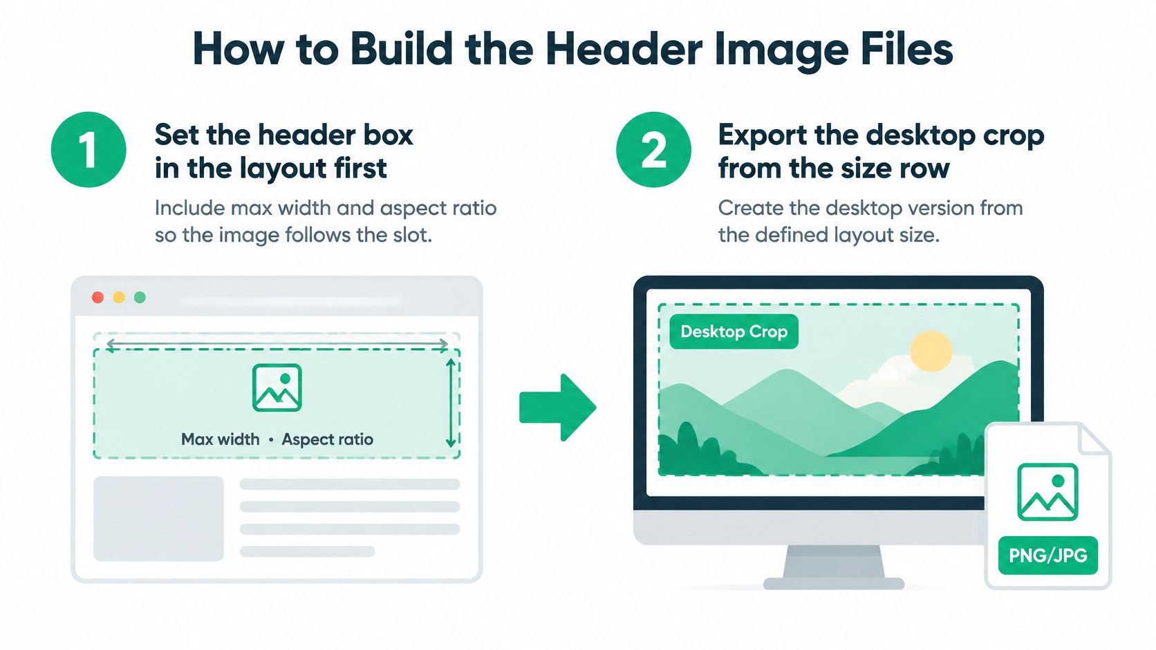
Build your header like a small production job, in order. Each step prevents a specific failure, and skipping an early step usually creates work later when the crop or file weight is already wrong.
The production sequence
- Set the header box first: Define the slot's max width, height behavior, and aspect ratio in the layout before you export anything. This prevents the common mismatch where the image is designed for a box the theme never renders.
- Export the desktop crop: Use the size row that matches the header's job. This gives desktop a composed image instead of a resized master with accidental edges.
- Make a second mobile crop: Recenter the subject, often around 800 px wide for a hero, and recompose for vertical space. This prevents the phone from inheriting a horizontal composition that loses the sides.
- Export width variants: From the master, produce widths such as 480, 800, 1200, 1600, and 1920 px. This prevents one oversized file from serving every screen.
- Write responsive markup: Use picture, source, and srcset for art-directed crops, with a sizes value that matches the actual slot. Use 100vw for a full-bleed hero or the actual column width when the header sits inside content. A wrong sizes value tells the browser to pick the wrong file.
- Reserve the space: Put width and height on the img, or an aspect-ratio on the container. web.dev guidance on responsive images recommends supplying multiple variants with srcset and sizes so browsers select an appropriate resource, and it connects that choice to rendered width, device pixel ratio, cropping, and whether the image becomes the Largest Contentful Paint element.
- Check the crop at actual widths: Preview at 375, 414, and 428 CSS pixels and on a desktop window. Look for clipped products, buttons over faces, and headlines sitting on busy detail.
- Test on physical devices: Use one iPhone-class device and one Android phone. Emulation misses some font rendering, browser chrome behavior, and crop results.
Work out each variant width before exporting
Use a simple calculation for each slot:
Needed image width = displayed CSS width × device pixel ratio, capped at the master width.
Say a mobile hero displays at 390 CSS px on a 2× screen. It needs about 780 image pixels, so your 800 px variant is the right file. A 1920 px file wastes most of its pixels on that phone, because the browser will scale it down after downloading all of it. The shopper pays for pixels that never become visible detail.
Do the same math for desktop. If your content column caps the header below full window width, don't export as though it were full-bleed. The slot decides. That's the whole point of building the box first.
The slip to watch for
The usual failure is a single src that always downloads the 1920 px file. The page can look responsive because CSS shrinks the image, while the network still carries the desktop original to every phone. Open your browser's network panel at a phone width and confirm which file the browser requested. Visual scaling and responsive delivery aren't the same thing.
Name your files by crop and width so you can audit them later, for example hero-mobile-800.webp and hero-desktop-1920.webp. Six months from now, you'll know which asset belongs to which slot without opening each one.
Success looks plain when you see it. The product stays visible at every width. Overlaid text remains inside the frame and readable. The phone requests a phone-sized file, not the desktop original. If any one of those fails, fix the crop or markup before you touch compression settings, because compression can't repair a wrong composition or a wrong file choice.
Fix Slow or Jumpy Headers and Run the Release Check
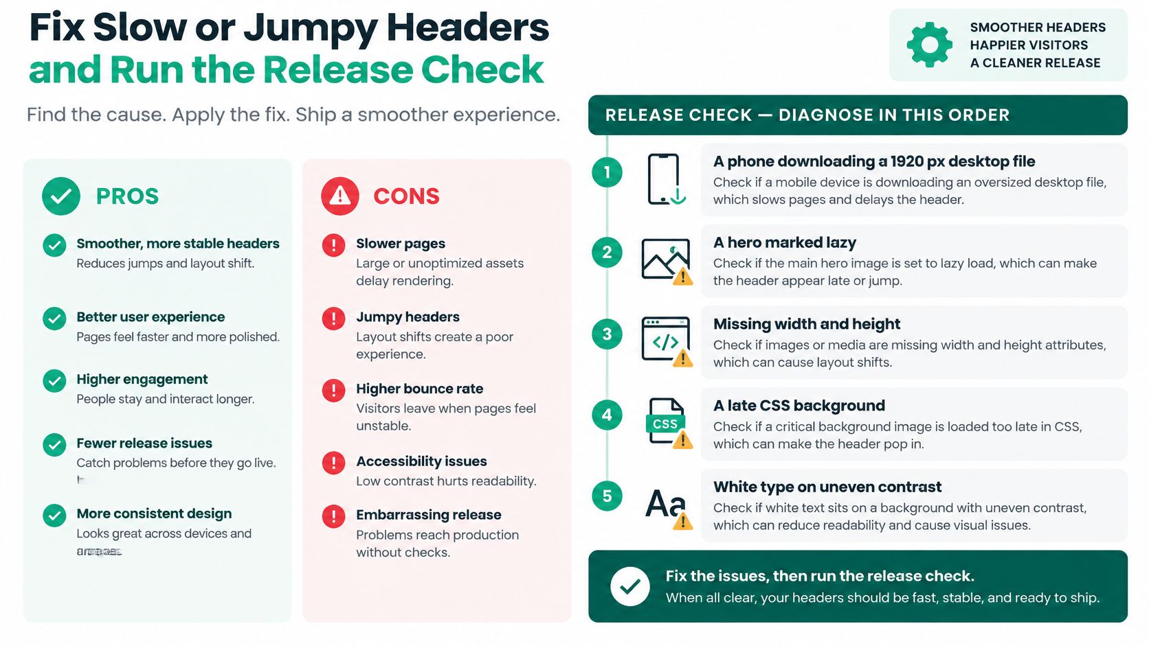
A broken header usually fails in a predictable order. Diagnose in that order before you redesign anything, because the first problem often hides the next one. A phone downloading a desktop file can make a good crop look slow, and missing dimensions can make a fast image feel unstable.
Diagnose in this order
- A phone downloading a 1920 px desktop file: The image looks right but arrives slowly because the browser fetched far more pixels than the slot needs.
- A hero marked lazy: The main visual appears late because the browser was told to deprioritize the first thing the visitor came to see.
- Missing width and height: The page jumps when the image arrives because the browser didn't know how much space to reserve.
- A late CSS background: The header art loads after styles resolve, so text can sit on an empty or partially painted area.
- White type on uneven photo brightness: The headline reads well over a dark corner and disappears over a bright shirt, window, or sky.
Core Web Vitals data on responsive images reports 88% good LCP with picture versus 78% with img srcset, while fixed-source images reached 82%. Treat those figures as benchmark context, not a guaranteed lift for your store. They tell you markup choices show up in measurements. They don't promise that swapping one tag will move your numbers by the same amount.
Header problems, causes, and fixes
| What you see | Likely cause | Fix |
|---|---|---|
| Phone downloads a huge file | One desktop source for every viewport | picture or srcset so narrow screens get a smaller width |
| Hero appears late | loading lazy on the first visible image | eager load and fetchpriority high; never lazy-load the LCP hero |
| Page jumps when the image arrives | No width and height or aspect ratio | Set intrinsic dimensions or a fixed aspect-ratio box |
| Soft or blocky product photo | Over-compressed or upscaled file | Stay in the 150–500 KB range and export at the displayed width times device pixel ratio |
| Headline disappears on a phone | Landscape art scaled into a tall slot | Separate mobile crop with the subject in the center safe zone |
| White text is unreadable | Photo brightness changes under the type | Scrim or panel; aim for 4.5:1, or 3:1 for large text |
Apply the matching fix
For the primary hero img, use loading="eager" and fetchpriority="high". Don't lazy-load it. Lazy loading is useful for images below the fold, but on the header it delays the main visual and can push back Largest Contentful Paint, the moment the largest visible image or text block renders.
Reserve space with explicit width and height or an aspect-ratio container. The browser can then hold the slot open before the file arrives, so copy, buttons, and content below don't shove around. If your header uses different desktop and mobile crops, make sure the reserved ratio matches the crop served at that breakpoint. A correct desktop ratio with a portrait mobile image still shifts.
Compress WebP or AVIF toward under 150 KB for a simple banner and under 500 KB for a detailed hero, then check the result at display size. Those are practical targets, not permission to crush a product photo until the texture disappears. If a detailed hero needs the upper end of the range to look clean, take it and save weight elsewhere.
If the header is a CSS background, preload it deliberately and confirm the browser discovers it early. Background images are easy to hide from the browser's early scanning, and they also make responsive art direction harder. When the image carries the product or main message, an img with responsive markup is usually easier to prioritize and test. If you keep a carousel, let only the first slide load eagerly. Loading every slide at high priority makes them compete with the one image the visitor sees first.
For text over photography, add a scrim, gradient, or panel and check contrast against 4.5:1 for normal text and 3:1 for large text. Don't judge contrast from the darkest part of the photo. Check where the actual words sit at phone size, because the crop may move a bright area under the headline. Wecomeet's guide to UX and UI is a helpful refresher on why readable hierarchy and contrast aren't decoration. They decide whether shoppers understand the offer at all.
Judge the result on a representative mobile connection, not office Wi-Fi. Aim for LCP at or under 2.5 seconds at the 75th percentile, and watch whether the layout moves as the header paints. These fixes belong with your wider work to speed up your Shopify store and improve conversion rates, because the header is often the heaviest first impression on the page.
Run the release check
Use this as a pass or fail gate on a phone, not as a loose review:
- Desktop file matches the chosen row: the exported source fits the header's job and slot
- Mobile file is a real second crop: the subject was recomposed, not just scaled down
- Subject and button text survive: check 360 to 390 CSS px and around 414 CSS px
- Format has a fallback: WebP or AVIF is served with a workable alternative where needed
- Narrow viewport requests a narrow file: confirm in the network panel that the widest file wasn't downloaded
- First image is eager with reserved space: no lazy loading on the hero, and no jump when it arrives
- Physical devices pass: confirm on one iOS device and one Android phone
Publish when crop, weight, and load priority hold on a phone. If the product is cut off, revise the mobile crop. If the phone still fetches the desktop original, revise the variants and markup.
Pay attention to where the header meets interactive elements. In cart and upsell contexts, product identity and controls have to stay legible on small screens, and a cropped thumbnail or shifted button can undo an otherwise good offer. Our UpServe popup design can be set down to the pixel for colors, corners, shadows and spacing, or started from a template, which helps keep that layer aligned with your header rather than fighting it.
Don't sign off from a desktop screenshot. The header earns its place when a shopper on a mid-range phone sees the product, reads the headline, and can tap the button without waiting for the page to settle.
Your header can only sell what shoppers can see, read, and tap without waiting, so pair a properly cropped, right-sized hero with storefront tools that keep the rest of the journey just as clear. ServeApps builds Shopify-native apps for self-service order editing, configurable cart drawers, and contextual upsell popups, so the clarity you create at the top of the page carries through the cart and after checkout. Visit ServeApps to see how SelfServe, CartServe, and UpServe can reduce support work and capture more revenue from the traffic your header earns.

Shopify Store Credits: Issuing, Redeeming and Accounting
Learn what Shopify store credits are, how they differ from gift cards and refunds, and how to issue, redeem and account for them.
Read more →
Can You Have Multiple Stores on Shopify? Plans and Limits
Can you have multiple stores on Shopify? Yes, through organizations or Plus expansion stores. Compare plan limits, eligibility and setup tips.
Read more →
Product Customizer App Shopify: Choosing the Right Tool
Compare native and third-party product customizer app shopify options on speed, theme support, variant mapping and SKUs before you install one.
Read more →